Data and AI Training
Home | Prices | Contact Us | Courses: Power BI - Excel - Python - SQL - Generative AI - Visualising Data - Analysing Data
Power BI Modern Features - Course Notes
These notes are originally for the session on “What’s new in Power BI for the data analyst” at the Manchester M365 conference on September 28th 2024.
There have been so many improvements to Power BI that it would be futile to try whizz through them all in under one hour. Instead, this session focusses on three of the most important improvements:
- reporting improvements, in particular the the new card visual. These are likely to be of interest mostly to people starting their Power BI journey,
- Visual Calculations, likely to be of interest mostly to intermediate level Power BI users,
- The DAX Query View, likely to be of interest mostly to expert Power BI users.
This session omits two major improvements to Power BI
- Copilot (AI) improvements, which Rishi will cover at 3pm
- Fabric improvements, which Josh will cover at 4pm
Improvements to Power BI visuals
There have been many improvements to Power BI visuals over the last year or so. These include:
- a new card visual
- a new button slicer
- some different style of bars: e.g. outline rather than solid. For example use solid for actuals and outline for forecast
- better data labels: add trend as well as value
- line charts: leader lines, smoothed and stepped lines
- sparklines
In this session, there is quick demo of some of these improvements and a guided tutorial on the new card visual.
The New Card Visual
Microsoft telemetry shows that the card visual is the most popular visual used in Power BI reports.
The old card visual has one big disadvantage in that it can only show one number, without any context. The new card solves this by enabling us to have detail metrics that put the headline figure into context, for example
- what is the change since last year?
- how far is this above a certain threshold?
The new card visual has many more formatting options and many more dynamic capabilities (visual properties that can be set by a DAX calculation).
The Microsoft team building these has announced delivery in several phases
- (June 2023) multi-cards, layout features, dynamic formats
- (Nov 2023) reference labels
- actions
- trends
- small multiples
The new card will eventually replace three existing visuals: the old card, KPI and multi-card visuals.
This snapshot compares the old and new charts. The new chart has the reference labels to add context to the headline value (the callout value).
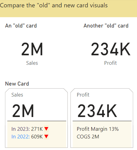
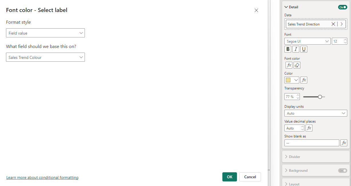
The new card is really a collection of cards. The first card, titled Sales, has two reference labels (for 2022 and 2023). The reference label is made up of three parts; a title, value and detail component. Each of these parts has many dynamic properties. For example, the detail has a data property that is assigned to the [Sales Trend Direction] measure and a font colour property that is set to the [Sales Trend Colour] measure.
Visual Calculations
Visual calculations provide an easier way to write typical calculations, such as running totals, than DAX measures.
The new visual level format strings, under Properties | Data Formats, released Aug 2024, now can be applied to visual calculations – so now there is a way to format these properly!
Visual Calculations - Specification
A visual calculation belongs to a single visual. It cannot be used from any other visual.
Visual Calculations are simple DAX calculations defined on a specific visual. They can refer to fields on the visual. They are executed in the scope of the visual.
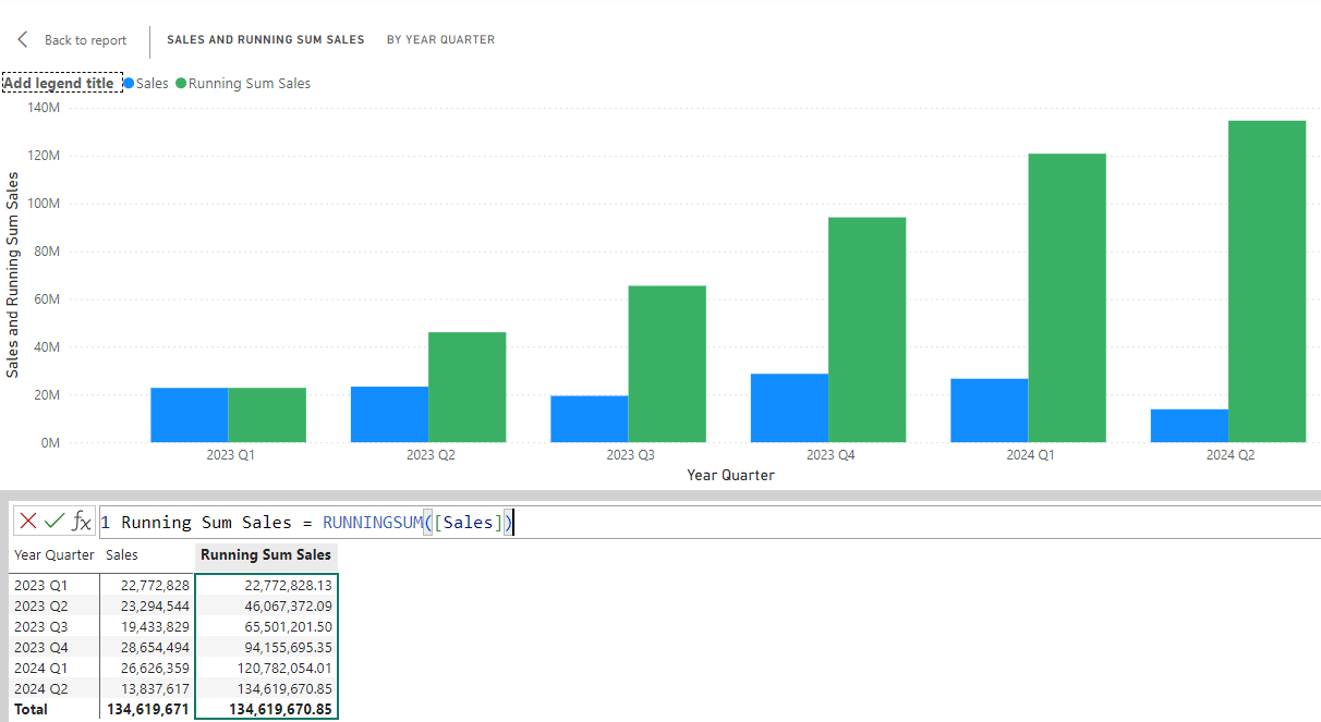
When creating visual calculations, Power BI Desktop shows a visual matrix. This has the data in the visual arranged with rows / columns.
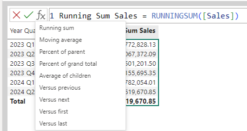
There is a standard template for typical calculations so no need to write any DAX - just point and click. These typical calculations include:
- running sum
- moving average
- change on previous / next / first / last
- percentage of parent
- percentage of grand total
The performance is better then measures, since visual calculations run on aggregated data.
There are some new high level DAX visual functions:
- RUNNINGSUM()
- MOVINGAVERAGE()
- Positional: FIRST(), PREVIOUS(), NEXT(), LAST()
- Functions to expand/collapse groups if there are more than two or more fields in rows area: EXPAND(), EXPANDALL(), COLLAPSE(), COLLAPSEALL()
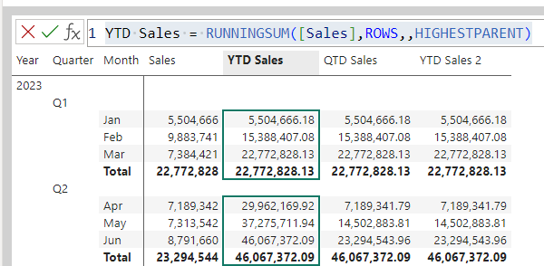
These allow us to create time intelligence functions more simply than with measures. For example, a Year-To-Date function:
YTD Sales = RUNNINGSUM([Sales],ROWS,,HIGHESTPARENT)
The importance of visual calcs
It is difficult to build good measures for even typical business calculations. This is true even for calculations like running totals that are easy in Excel. People have to understand how filter context and row context applies. These are hard concepts, requiring a lot of practice to master. Visual Calculations solve this problem. People can write these calculations with simple DAX or just point and click for many situations.
A few people suggest that visual calculations may have unintended consequences for Power BI good practices.
- Measures: write once, use everywhere
- Visual calcs: write every time, use once
DAX Query View
When we have to write DAX measures, the new DAX query view provides a much more productive environment than the old “formula bar” approach. The DAX Query View is a proper script editor.
This section covers:
- an introduction to the DAX query view and how it changes the “flow” of how we build measures,
- the EVALUATE statement that starts all our DAX queries,
- the SUMMARIZECOLUMNS() function, the starting point for most queries,
- how to DEFINE a measure and add it to the model,
- the best approach to building measures using the DAX query view,
- the quick queries, e.g. define all measure in the model
The design of the Query Editor has three touches of genius
- Quick queries: these avoid the “blank page” trap, helps learn DAX
- Update model: keep in the “zone”
- Run DAX query for visual: helps understand DAX and Power BI at adeeper level
The benefits are not immediately obvious but are profound (so stick with it until it become second nature)
Walkthrough of the DAX Query View
In interactive sessions this will be a live demo.
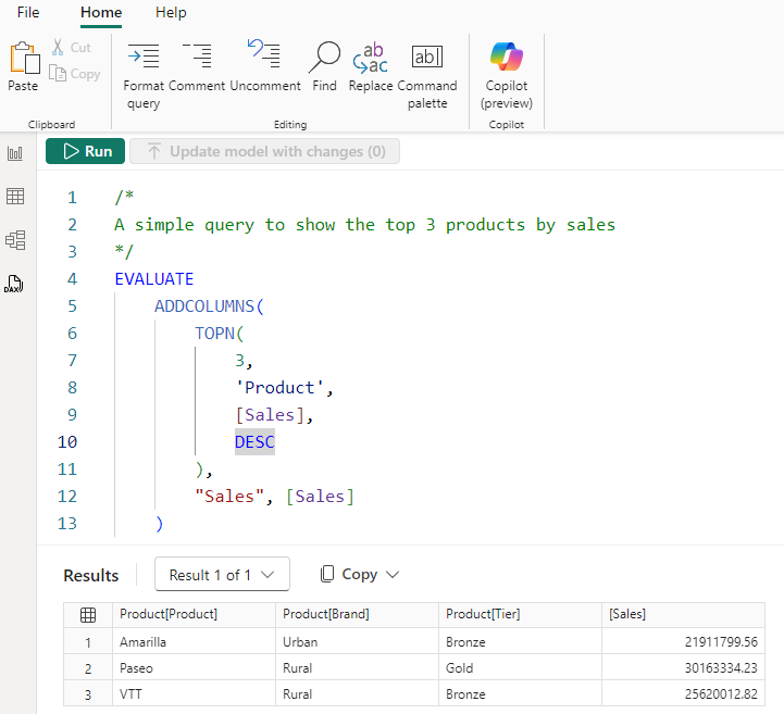
Here is a typical short query run in the DAX Query View.
- the DAX query view always returns a table
- the EVALUATE is always necessary
- the top half is an editing pane and the botton half is the results pane
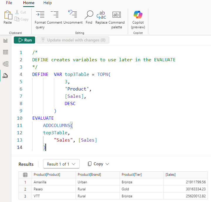
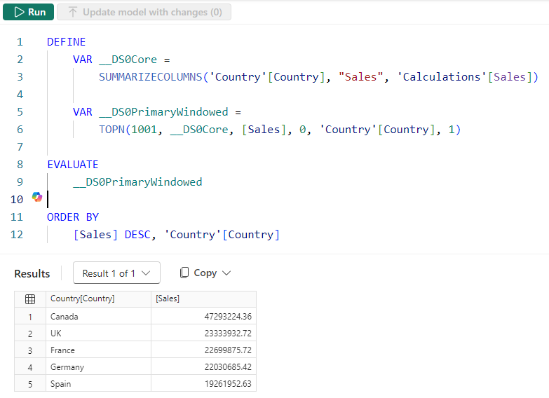
We can use variables to make the DAX more readable. Notice the DEFINE VAR syntax.
The Performance Analyser Pane has a “Run in DAX query view” button to show and run the DAX that a visual, in this case the bar chart, uses to obtain its data.
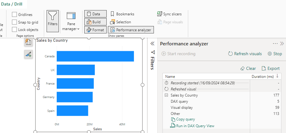
Power BI visuals use the SUMMARIZECOLUMNS() function to return the data they need
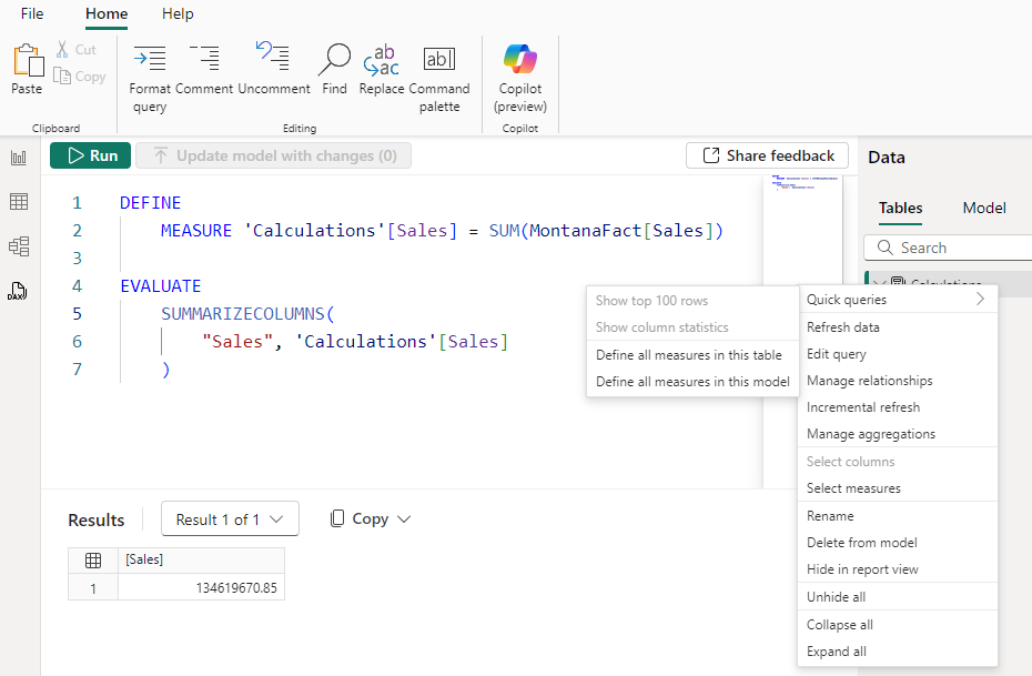
Quick queries allows us to define all measures. The DAX query view generated the DAX. Note:
- the DEFINE MEASURE syntax
- the use of the SUMMARIZECOLUMNS() function. This is a very powerful function.
This is often a good starting point for creating new measures and adding them to the model. For example, we have extended this to create and test two new measures. Notice that:
- the two measures (Profit and COGS) are currently defined only as part of the query. They are not yet part of the model until we click on the ‘Update model with changes’ button.
- the SUMMARIZECOLUMNS() has a new argument so that it creates a row for each country
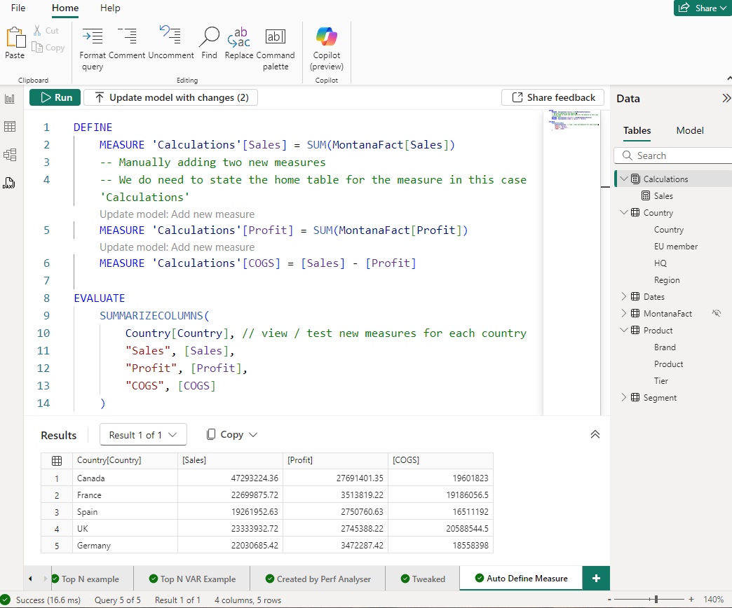
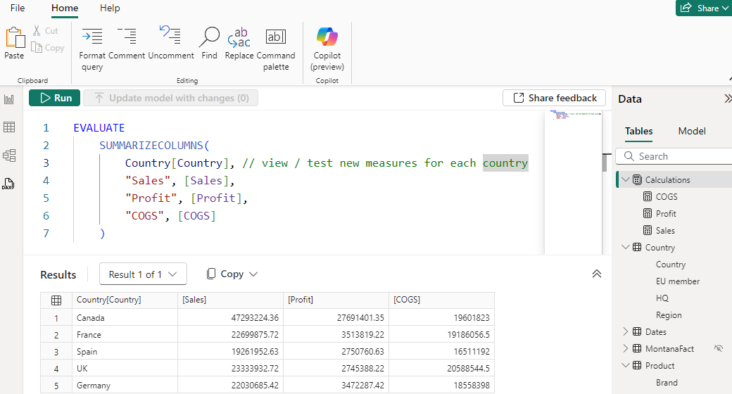
Once updated, the new measures are now in the model.
Other recent improvements
There have been many other improvements over the last year or so. These include:
Reporting Improvements
- New button slicer (Nov 2023)
- Different style of bars: outline rather than solid. For example use solid for actuals and outline for forecast (Dec 2023)
- Better data labels: add trend as well as value (Dec 2023)
- Line charts: leader lines, smoothed and stepped lines
- Sparklines
DAX and Data Modelling Improvements
- calculation groups. These have been available using third party tools for a while but recently “lit up” in Power BO Desktop but most people don’t have access to external tools: internal availability in Power BI Desktop drives large scale adoption.