Data and AI Training
Home | Prices | Contact Us | Courses: Power BI - Excel - Python - SQL - Generative AI - Visualising Data - Analysing Data
Tabular Data
Most of the data that we analyse will be tabular - arranged in a table with rows and columns. Tabular data must have:
- one observation per row
- one variable per column
- one atomic value per cell
If our data is not in a tabular format, our first step is to clean and reshape it so that it is! This is essential. The operations to analyse tabular data all depend on this step.
In Excel, always format data as an Excel table. This is a structured range of data that groups related information into rows and columns, and enables efficient data analysis. If it is difficult to do this, it suggests a re-think about the data is necessary.
Each column in the table must have a datatype (explained below). Datatypes are explicit in relational databases and SQL but implicit in Excel.
Characteristics of columns
We can describe the set of values in a columns in many useful ways.
DataType
The datatype contains the values that can be placed in the column. Common datatypes are
- numeric, either whole numbers (integers) or real numbers (floats),
- date and/or time,
- boolean,
- text.
Text: categorical or ordinal
Categorical variables represent distinct categories or groups. A categorical data can take a small set of values e.g. journey type, crime category.
We can split categorical variables into nominative and ordinal types. Nominal variables have no inherent order, for example,
- types of fruits: apples, bananas, oranges
- German car makes: VW, BMW, Audi
- countries in the United Kingdom
Ordinal variables have a meaningful order, for example,
- education levels: GCSE, A-level, university degree
- body mass index (BMI) classification: underweight, normal, overweight, obese
- days of the week (and months of the year)
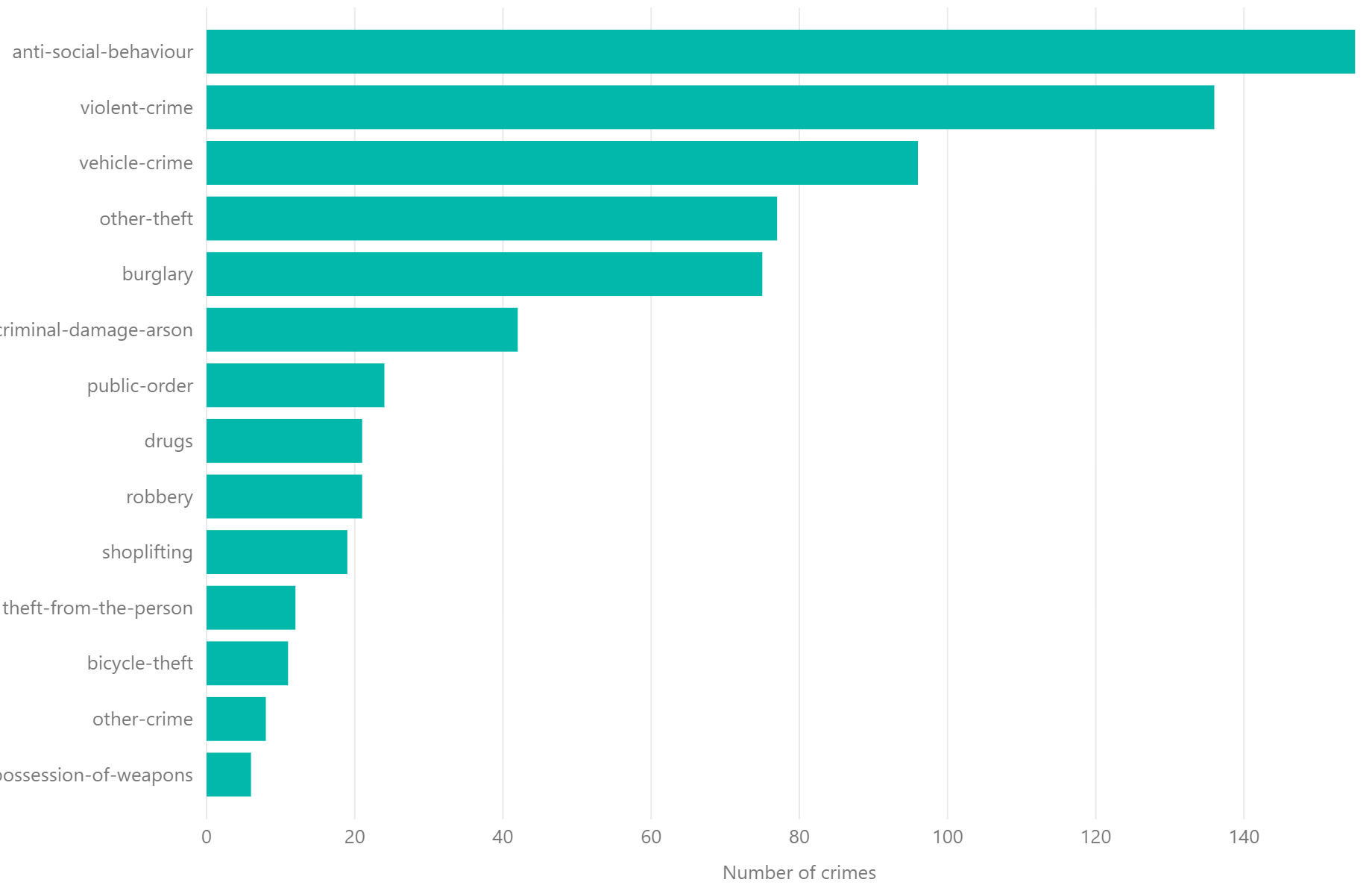
The x axis of this chart is categorical column

Numbers: Discrete or Continuous
Numbers can be classified into discrete or continuous types. (Categorical and ordinal variables are always discrete.)
Discrete data consists of distinct, separate values, often counted in whole numbers, for example
- number of children in a family
- number of goals scored in a football match
Discrete data is typically counted.
Continuous data can take any value within a given range. A continuous variable can take an infinite set of ordered values. Continuous variables are typically measured rather than counted, for example
- revenue,
- temperature,
- number of journeys
When we want to see the distribution of a set of continuous values, we will bin (group) into ranges: For example, body mass index is a continuous numerical value, and is often binned as follows:
- BMI less then 20: underweight
- BMI between 20 and 25: normal
- BMI between 25 and 30: overweight
- BMI above 30: obese
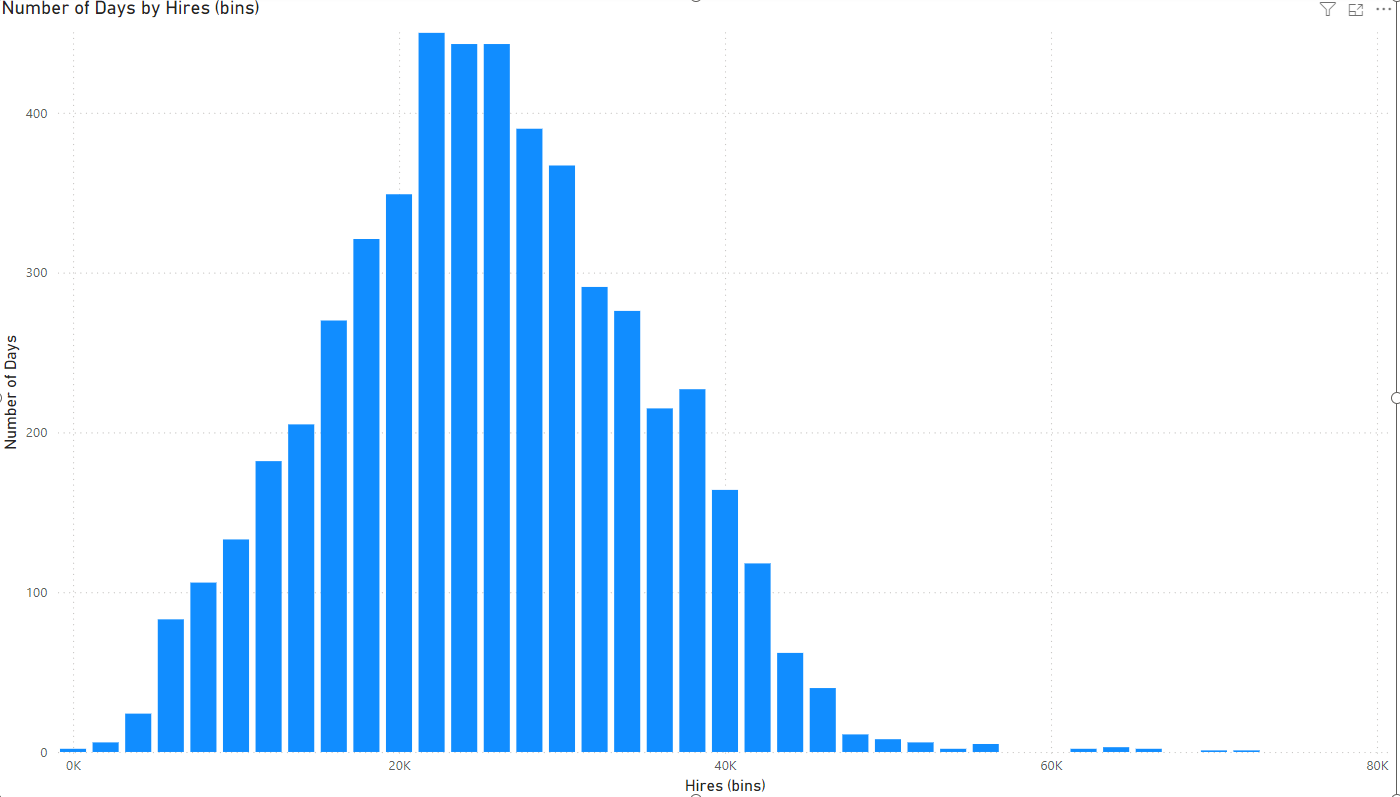
The source data for this column chart is the number of bikes hires by TfL (the public transport system in London) on each and every day in the last decade. This is effectively a continuous variable since it can take any whole number between roughly 4,000 and 80,000. These numbers are binned into ranges and the column height represents the number of days for each range. This allows us to see the distribution.

Mandatory values. Missing vs not applicable values
Often columns are constrained so that every row must have a value - no row can have a blank or NULL value. Ideally this is the case for most columns since it makes life simpler when we don’t have to consider blank values.
Hints:
- Consider whether the values in a column are mandatory or optional i.e. some rows may have missing values.
- Analyze how missing data is handled, distinguish between genuinely missing versus not applicable.
Uniqueness
Some columns must contain values that are unique. There can be no duplicate values.
Cardinality
The cardinality of a column is the number of distinct values in the column. Columns with few distinct values are low cardinality. Columns with many distinct values are high cardinality.
This is important often for the choice of visualisation. For example, we may not want to choose a bar chart with more than 10 bars (so a column with a higher cardinality would not be a good choice to place on the x-axis)
Examples of a low cardinality column could be
- temperature setting (3 distinct values: low, medium, high)
- Size (5 distinct values: tiny, small, medium, large, huge)
Examples of a high cardinality column could be
- passenger full name
- date of birth
Cardinality is sometimes important when we design reports with certain software tools. For example, Power BI is more performant with low cardinality columns.
The grain of a table
When creating a table, it is important to be able to articulate what the grain is. What does a single row in your table represent? Can you define this clearly?
Numbers: Is zero important? Can numbers go below zero?
Determine whether zero holds a specific meaning in the context of the data. For example,
- in the case of revenue, zero might indicate no revenue. (These are called ratio scales.)
- in temperature, zero Celsius represents a point on a scale where water freezes. (These are called interval scales.)
Consider whether a variable can have negative values. This is common in financial data (for example, profit and loss) but less common in measures like height or weight.
Dates: Is time important?
If the dataset includes dates (and it usually does), consider whether the specific time of day is relevant to the analysis.
Surrogate keys
Surrogate keys are synthetic values, often integer,s used for the primary key. These are useful when there is no natural primary key and often created by large IT systems.
For example, some systems use a date key, in a YYYYMMDD format e.g. 20250312 rather than a date e.g. 12-March-2025.


Natural Grouping or Hierarchy
A hierarchy is a set of columns going from broad to narrow categories. There are often natural groupings or hierarchies in the data, such as:
- geographic regions (for example, countries, states, cities)
- organizational structures (for example, division, departments, teams)
- date hierarchy (year, quarter, month, day)
Hierarchies often form the basis of a guided navigation path from summary to details.


A note about terminology
Different data professionals have different names for (nearly) the same thing and this may sometimes lead to confusion. Before starting on our data modelling process, we consider the characteristics of the data. We normally analyse each variable (column) of the data in several ways
- dataset, table, query
- column, field, variable, attribute
- row, observation
- quantity, measures – numeric columns, usually aggregated
