Zomalex | Data and AI Training
Iris Dataset
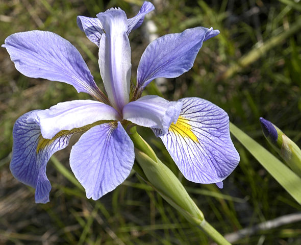
The Iris dataset is a classic dataset from the 1930s. The data contains 150 rows (observations) of irises; 50 from each of 3 species: setosa, versicolor and virginica. Here is an example of each species

setosa

versicolor

virginica
Data Description and Links
The dataset has 6 columns:
- observation – a unique number
- petal length (in cm)
- petal width
- sepal length
- sepal width
- species The data is in CSV format in a public file. The URL is https://zomalextrainingstorage.blob.core.windows.net/datasets/misc/iris.csv.
The data looks like this (not all rows shown)

Suggested Approach
- Import the iris data CSV file
- Build a scatter plot of petal length vs petal width and use colour to differentiate between species
- Explore different formatting options to make a better chart; e.g. colour, shape, fill point, axes start and end values
Power BI lab
If analysing the data with Power BI, here are some helpful hints
- While in Query Editor check the Column Quality and Column distribution boxes in the View pane. What does this tell you about the data?
- Set the default summarisation of the Observation column to “Don’t summarize”
- Create a measure named to count the number of Irises. e.g.,
Number of Irises = COUNTROWS(irisdata) - Use ColorBrewer to pick a palette of three qualitative colours and replace Power BI’s default colours with these
- Choose helpful labels for both axes and a good title for the chart
- Add labelled images of irises to the page or even as a background to the chart?
- Add an overall trend line or a trend line for each species. Is this helpful?