Zomalex | Data and AI Training
Titanic Dataset
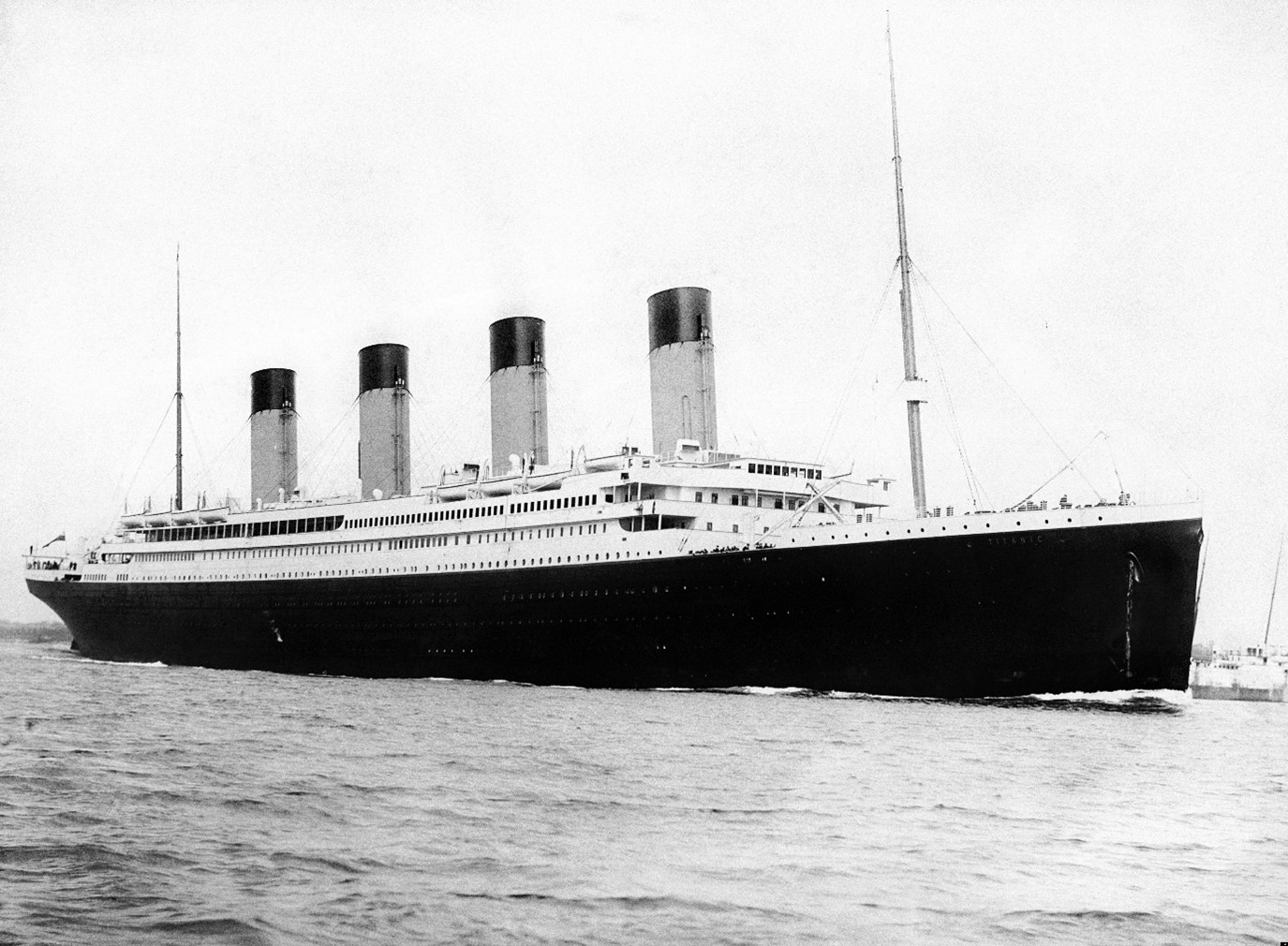
Almost everyone knows the story of the Titanic. In April 1912, this magnificent ship left Southampton on its maiden voyage to New York, but it never arrived. It hit an iceberg in the Atlantic and sank. There were over 2,000 people on board. Less than half survived.
A century later, this Titanic dataset is a classic case study for rookie data scientist to build a predictive model to determine who is likely to survive or perish (ignoring the fact that this is a matter of historical record). However, we will visualise the data with Power BI and see if we can gain some intuition and who did and did not survive and why. We know from the film that Kate Winslet survived but poor old Leo DiCaprio did not – is that an accurate reflection?
This dataset contains a partial list of the passengers on board including variables (columns) such as Name, Age, Sex, and Pclass i.e. whether they travelled 1st, 2nd or 3rd class.
Data
There are two files - the same data either in:
Here is a description of the columns:
PassengerIdSurvived, 0 = Died, 1 = SurvivedPclass, Passenger ClassNameSexAgeSibSp, Number of siblings (brothers/sisters) and spouses in the family group travelling with the passenger (excluding the passenger)Parch, Number of parents and children in the family group travelling with the passenger (excluding the passenger)TicketFareCabinEmbarked, S = Southampton, Q = Queenstown, C = Cherbourg
This dataset is used in several exercises - for example Power BI and Generative AI.
Generative AI Exercise - Suggested Approach
Here are some suggested prompts to start your analysis. The first prompt provides the context. This is especially useful as some of the variable names are difficult to understand.
- Act as an data analyst. The attached data has a partial list of passengers on the Titanic. Here is a description of the columns insert here
- Describe the data
- Are there any data quality issues in the data?
- How many passengers were in each passenger class?
- What percentage of passengers survived?
- What factors made it more likely that a passenger would survive?
- Can you provide the results of your analysis in a few charts.
Power BI Exercise - Suggested Approach
We need to clean the data. Some variables have missing values. The names of the variables are cryptic and so are the values. We’ll start by making the variable names and values easier to understand.
Import the data in the Passengers tab of the ‘Titanic Data’ workbook.
Remove the Ticket and Cabin columns (we don’t need them in this exercise).
Rename the Sex column to Gender.
Add a new column named Survival, with two values Died or Survived based on the value of the Survived column (0 and 1 respectively). Remove the Survived column – we no longer need it.
Add a new column PassengerClass with values First, Second and Third.
Change the datatype of both PassengerClass and Survival from Any to Text.
Add a custom column, FamilySize, with formula = [SibSp]+[Parch]+1. Change the datatype to whole number.
In the Embarked Column, replace any blank values with “S”. Then replace S, C and Q values with Southampton, Cherbourg and Queenstown respectively.
Create a new measure. Use the formula PassengerCount = COUNTROWS(‘Passengers’)
Build some charts to show the number of passengers by gender, class etc,
Build a bar or ribbon chart to show the age distribution of passengers.