Data and AI Training
Home | Prices | Contact Us | Courses: Power BI - Excel - Python - SQL - Generative AI - Visualising Data - Analysing Data
Building Geospatial Maps with Power BI Course Notes
These are the course notes.
The two main map types
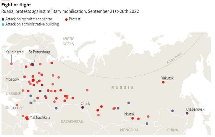
Point(Bubble, Circle) Maps
- There is a single marker (circle or other shape) at the location of each data point.
- The size (area) of marker is often proportional to a numeric value.
- The colour (and possibly shape) of the marker represents a categorical value.

Example Point Map - Source: The Economist
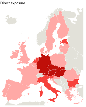
Choropleth (Area, Shape) Maps
Use when location, size and boundaries are important.
Colour can represent either:
- Different categories e.g. countries, states
- A sequential or diverging numeric scale e.g. risk, cost, temperature
Technical note: Shape files come in many formats: (ESRI) shapefile, GeoJSON, TopoJSON

Example Choropleth Map - Source: The Economist
Power BI Map Visuals
Power BI has several visual map types. We will use two of these in the course.
The Azure map visual is the most important map visual by far. Microsoft recommend this for new projects and they make regular improvements to its capabilities. It will at some stage have all the capabilities of all the other map visuals combined and is intended to replace them.
- Performance is better than Bing: faster, more points,…
- Functionality: oblique, bar chart views, reference layers,..
The Bing map visual is the classic map visual and we include it in this course since many reports existing reports use it.
- Original Map Visual
- Point maps only
- Limited capabilities
- Geocodes UK postcodes, nothing else
- “Deprecated” in favour of Azure Map
Case Studies
The hands-on labs will use two case studies.
- Price Paid SW12: this contains data for about 18,000 property sales in a part of south London. We will use this to build point maps.
- Election Results 2024: this contains data about the UK 2024 election results. We will use this to build both point and area maps.
Using Map visuals with other visuals on the report page
We can combine maps with other visuals on the same page to good effect.
- We can add customise the standard tooltip, or build a custom tooltip, to show or navigate to more details about a particular data point on the map.
- Other visuals on the page can filter the data on the map.
Building Maps – Helpful Hints
Here are some hints when building maps in Power BI. These are born of experience and frustration.
- Geocoding is useless apart from UK postcodes.
- Point data must have latitude and longitude (no other co-ordinate system will do).
- It is helpful to set data category of latitude and longitude fields.
- Be careful with formats and projections of shape files.
- Be careful and precise with properties – one mistake results in nothing to see which makes it hard to find the problem.
Useful Mapping Resources
ONS UK Open Geography Portal
The ONS UK Open Geography Portal – UK shape files and locations Open Geography Portal.
This contains boundary datasets, available in various formats, each denoted by specific suffixes.
- BFC (Full Clipped): Full-resolution boundaries
- BGC (Generalised Clipped): Boundaries generalised to a 20-meter resolution
- BSC (Simplified Clipped): Simplified boundaries where minimal detail is sufficient.
- BUC (Ultra Generalised Clipped): Ultra-generalised boundaries with a 500-meter resolution where only the most basic outline is needed
The higher the resolution the larger the file and the more time needed to load. For our purposes the BSC or BUC are sufficient. The BFC file is too large to load into Power BI Desktop.
The final C indicates clipped to the coastline at the Mean High Water mark, providing detailed representations without extending into the sea. (There is also a BFE version that extends into the sea but we don’t need this.)
Other resources
mapshaper converts shapefiles into GeoJSON and TopJSON, with WGS84 projection if needed.
ColorBrewer provides colour advice for maps.
QGIS – free open source map editor (not covered in this course).
The Ordnance Survey OpenData contains OpenData geospatial datasets from OS and other data providers.