Data and AI Training
Home | Prices | Contact Us | Courses: Power BI - Excel - Python - SQL - Generative AI - Visualising Data - Analysing Data
Chart Types Quiz
This is a light-hearted quiz, using examples of charts and dashboards from public sources.
Bar and Column Charts
Do you consider the column chart of the net income of the Top 20 revenue-generating club effective? Why? Football clubs’ revenues rebound from covid—especially in England, The Economist
Figure 1. Participation in education and employment of 16- and 17-year-olds in England shows a 100% column chart. Are there more approrpriate types of visualation? Figure 1, Latest trends in further education and sixth form spending in England (ifs.org.uk)
Page 5 of this Power BI dashboard shows a clustered column chart. Is It effective? How could we improve it? NHS Digital Data Dashboard, Hospital Activity Outpatients page 5
This article shows several bar and column charts. These are effective. What decision did the designer take to make them so? Number of people using social media platforms, 2019 (ourworldindata.org)
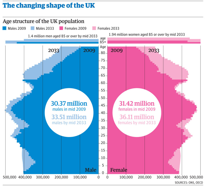
This is a variation of a bar chart, called a pyramid chart. It shows the size of the UK population by age, in2009 and forecast 2033, split into male / female. Why has it been used for this data? What does it do well, and not so well? Population-graphic-002.jpg (940×789) (guim.co.uk)
Line charts
This shows the first ever line chart, created by William Playfair in 1786. Have there been any great improvements in the last 240 years? Playfair’s trade-balance time-series chart, published in his Commercial and Political Atlas, 1786
These line charts show data where there is some uncertainty about the values. What techniques do they use to show the range of possible values? Coronavirus (COVID-19) Infection Survey, UK - Office for National Statistics
This line chart has two innovations: it is an area chart and has a button to show the data over time. Do these innovations add to our understanding? Alcohol consumption per person, United States, 1850 to 2013 (ourworldindata.org)
This line chart has lots of interactive features. What are they and are they useful /effective? It is also a quite complex: a line and column chart combination. What are your views on this? SEGRO Plc stock - Yahoo Finance
The line chart titled “Figure 1: The top 100 baby boys’ and girls’ names for 2021, have varied in popularity over time” has some interactive features and is also personalisable. Are these interactive features effective? Baby names in England and Wales - Figure 2a
Pie Charts and Treemaps
Experts suggest that we avoid pie charts. Do this chart support that view? Fig. 1 , British Dental Journal (nature.com)
The treemap was invented as a better pie chart. This one shows the composition of the Americam stock market by company, with area proprtional to the size of the company. What are the characteristics of the data that make a treemap a good choice in this case? Stock Market Overview - Nested Treemap , Tableau Public
Scatter Plots
This scatter plot compares alcohol consumption and GDP for several countries. Does it tell us anything about the drinking habits of different nations? Alcohol consumption vs. GDP per capita, 2018 (ourworldindata.org)
Complex Charts
How does this Mekko chart differ from a stacked column chart? Would you be comfortable presenting this chart in from of a general audience? Picture1.jpg (1443×834) (mekkographics.com)
This is a combination of bubble chart and pie chart. Is it effective?
Ranked: The Top 100 Most Valuable Brands in 2022 (visualcapitalist.com)
This plot is known as a strip plot. Why have the designers chosen to use this plot? Europe’s freakish winter heatwave breaks records , The Economist
Figure 1 shows a Sankey chart. sankeys are god at show the flows from a source to a destination. This shows teh number of people from each social economic background, going (or not going) to a type of university, then into an income band. Does it work? Figure 1, University social mobility , Impact of Social Sciences (lse.ac.uk)
This is a grim topic but does the horizon chart lend weight to the argument in the article that it is a particul;ar generation that has abused drugs. Middle-aged generation most likely to die by suicide and drug poisoning
Small multiples
This article uses small multiples and column charts to summarise the narrative arc of Jane Austin’s novels. Does this dispense with the need to read her books? Introduction to tidytext (r-project.org)
Text & Tables
This grid shows the cheapest date to fly to Warsaw. Is it helpful?
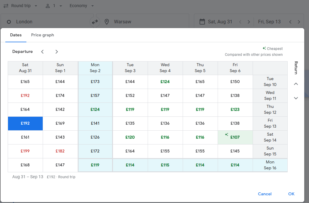
You can use the link - you will need to change the dates London to Warsaw , Google Flights, date grid
This report, from M&G, a financial firm, analyses the value that its funds have delivered to investors. Several descions have been made to the design of the table on page 13. Are these dispassionate? Page 13, MANDG Investments Annual Value Assessment Report 2020 – 2021
Badass Numbers and Scorecards
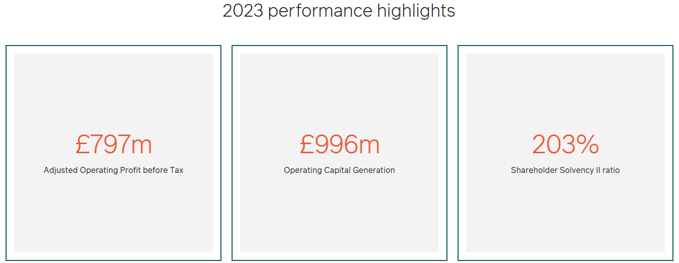
The 2023 annual report starts with three cards. Why may these not be the most helpful for readers? Annual report – M&G plc (mandg.com)
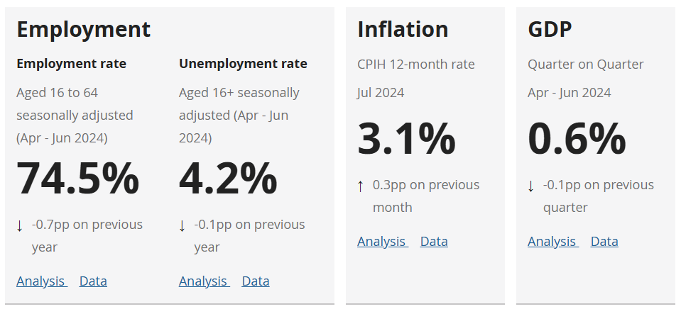
The ONS main page also highlights some key numbers. Are these better designed? Home - Office for National Statistics (ons.gov.uk)
You want scorecard examples. The World bank has them by the bucketload? What were the designers thinking? Home , World Bank Group Corporate Scorecard
Maps
Is this a good use of a bubble map? If so why? Where we do it , SEGRO
Does the time-lapse help with this area map? Annual change in hydropower generation, 2021 (ourworldindata.org)
Dashboards
Here is a typical dashboard. What are the good, bad and ugly features? NHS e-Referral Service (e-RS) open data dashboard - NHS Digital
Here is a large dashboard / report from the NHS measuring the quality of maternity services. It has been built in Power BI, a very popular business intelligence tool from Microsoft. What were the design considerations? Who is the audience? Is it effective? NHS Maternity Services Dashboard
Other
How many different chart types are featured in this article. For bonus points, name them all. 11 charts on the problems facing the NHS - BBC News
These are visual simulations. Apart from the wow! factor, do they provide insights into how infectious diseases spread? Why outbreaks like coronavirus spread exponentially, and how to flatten the curve - Washington Post