Data and AI Training
Home | Prices | Contact Us | Courses: Power BI - Excel - Python - SQL - Generative AI - Visualising Data - Analysing Data
A Glossary of Visual Types
This sections show and names several common chart types.
Bar and column charts
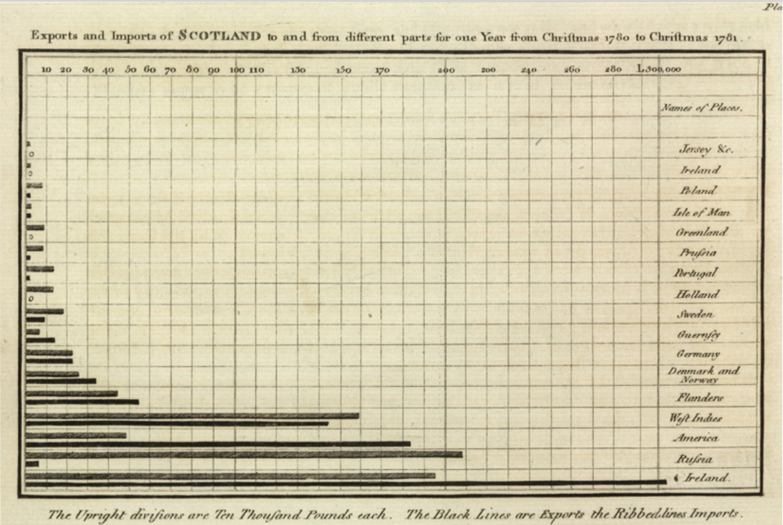
Bar charts have horizontal bars, column charts have vertical columns.
Bar charts are considered boring but are easy for readers to understand.
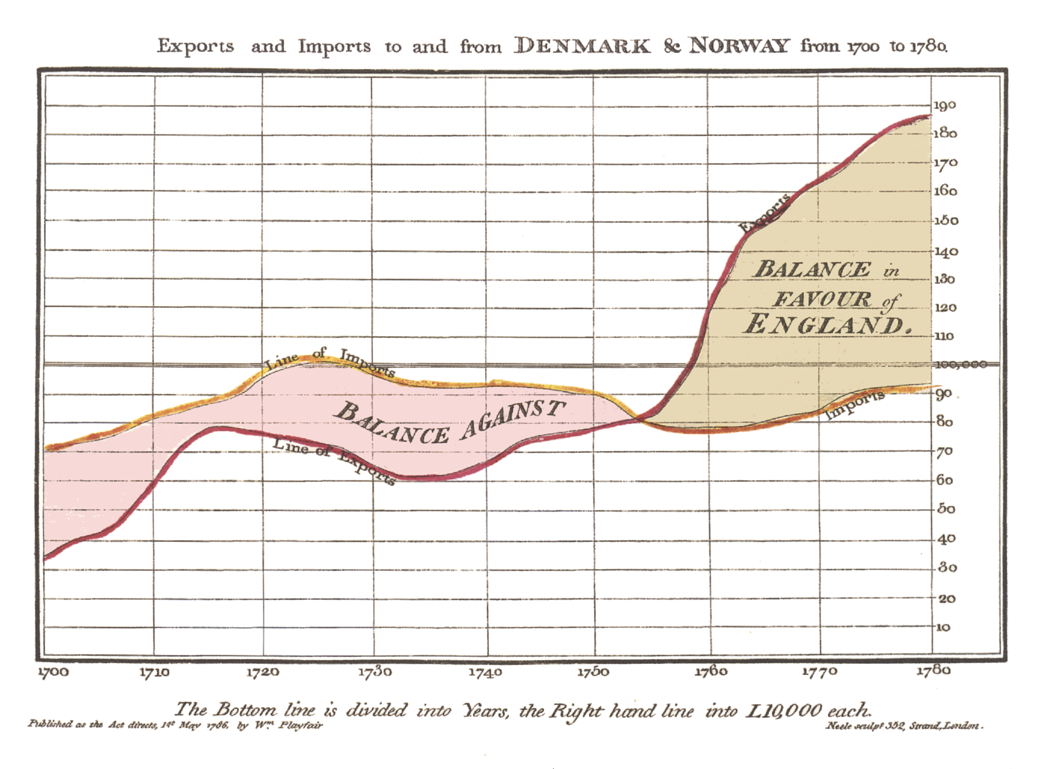
This is the very first bar chart ever recorded, also by William Playfair in about 1780.
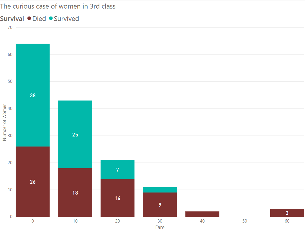
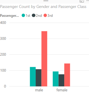
Bar and column charts can be stacked or clustered (side-by-side). It is best to only two or three at most items.
An example stacked column chart.
An example clustered column chart.
Line Chart
Line charts usually have dates on the x-axis and show progress over time.
This is the very first line chart ever recorded, also by William Playfair in about 1780.
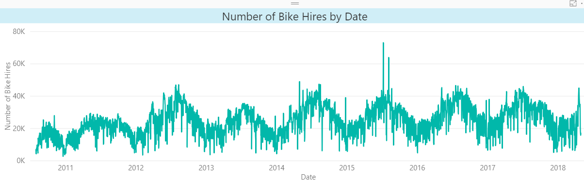
This line chart shows the seasonal nature of bike hire volumes over several years.
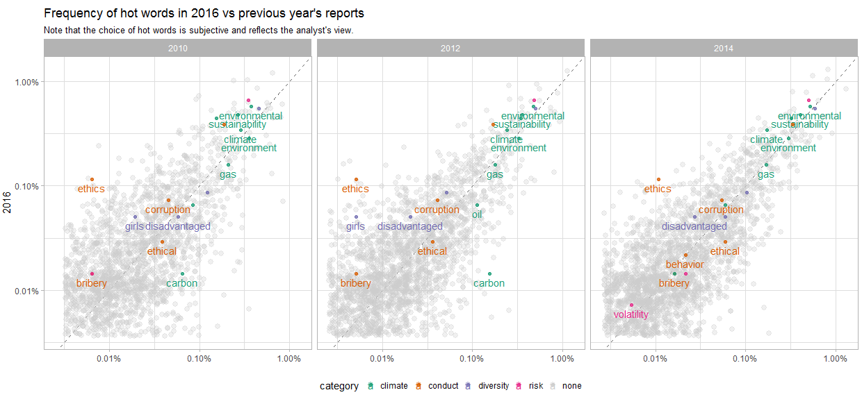
This line charts suffers from having too many lines of different colours.
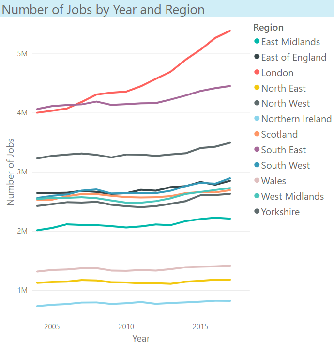
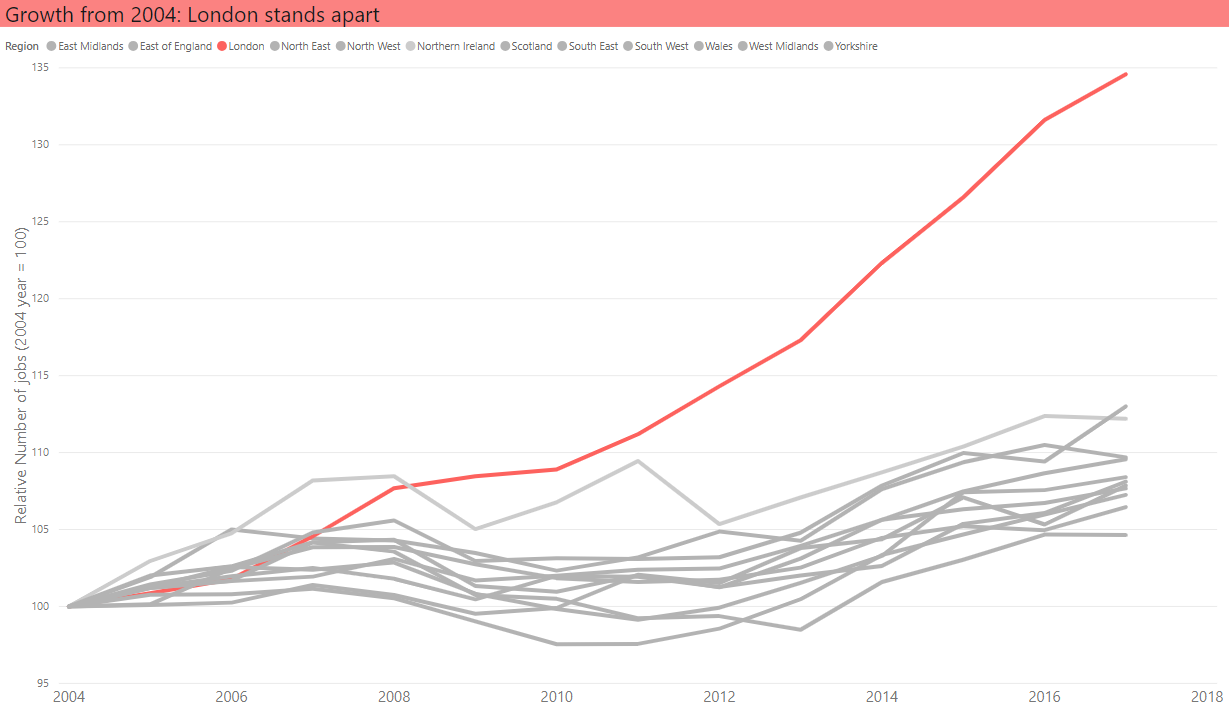
This line chart is used for emphasis - to show that London is an outlier to the other UK regions.
Pie Charts
Pie charts show composition (parts in a whole). They are very popular but are scorned by data visualisation experts. Have a look at the chart below and see if you can understand why.
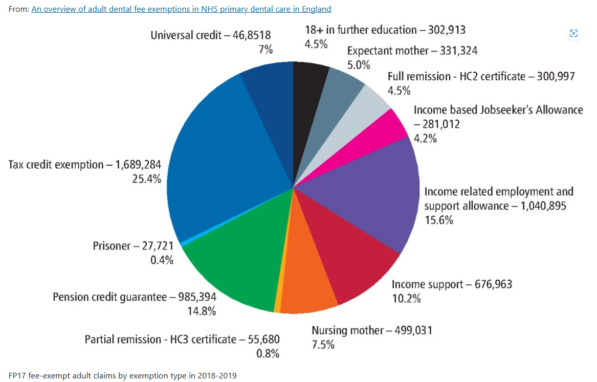
Source: An overview of adult dental fee exemptions in NHS primary dental care in England
Scatter Plot
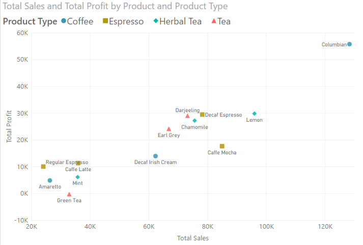
This scatter plot shows the relationship between sales and profits for ceratin types of drinks.
Card
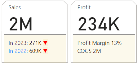
Cards highlight important numbers. They are often placed at the top of the dashboard to show the critical numbers for the organisation.
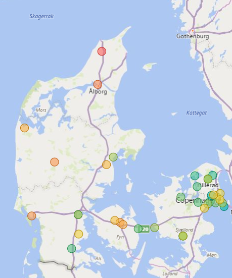
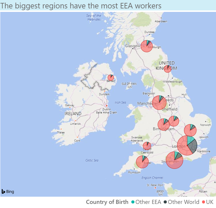
Bubble Map
Bubble maps (also known as circle or point maps) are most useful where the location is a specific location.
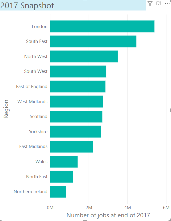
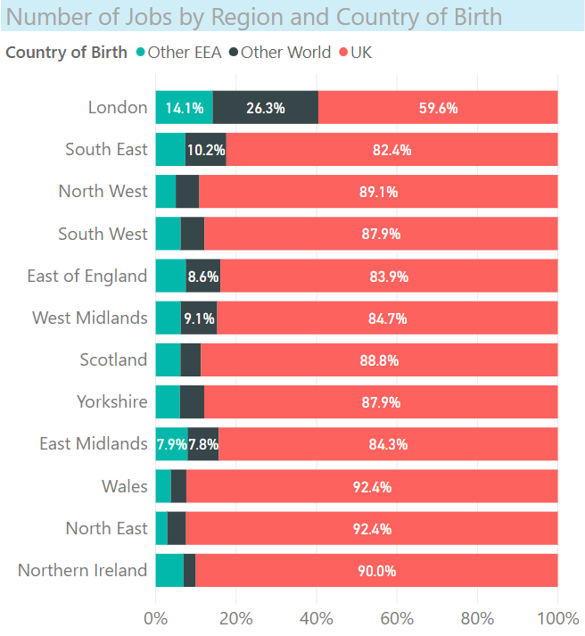
The chart below shows the number of jobs in each UK region split into three categories. Does it succeed?
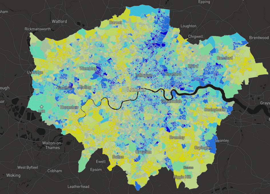
Shape Map
Shape maps (also known as choropleth maps) are useful where we want to show the size and boundaries of an area.
This area map shows the level of deprivation in London. Dark blue areas have the most deprivation and yellow the least.
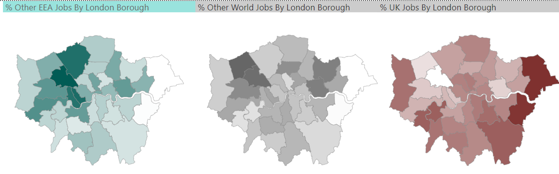
However they can be misleading, by equating area with a variable. The three maps below show, for each of the 32 London borough, the percentage of people in work who were born either in the EU (named EEA, pre-Brexit data but excludes the UK), the UK, or the rest of the world (named Other). In what way could these maps be misleading?
Tables with conditional formatting
Conditional formatting of the values in a table can make the table easier to read and understand. There are a few types of conditional formatting:
- data bars
- background colours
- sparklines (tiny line or column charts next to a value to show the trend)
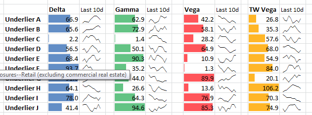
Example: data bars
Data bars helps us to see quickly which numbers are largest, which are negligible, and to spot anomalies.
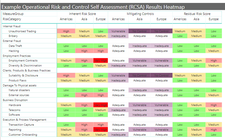
Example: background colours
This Risk and Controls Self Assessment (RCSA) uses background colours to show the severiry of the risk.
Example: sparklines
Sparklines provide context to the current value by giving us the gist, but not the detail, of the time-series history.
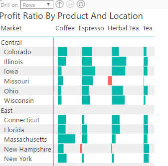
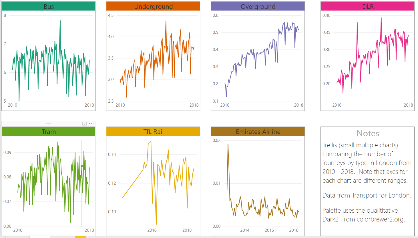
Small mutiple charts
Small multiple charts can be very useful. Instead of a single complex chart, it may be easier to show several smaller simpler charts.
Small Multiples of bar charts
Small multiples of scatter charts
Small multiples of line chart (with free y axis)
Other Visualiation Types (use with care!)
100% stacked bar chart
100% stacked bar chart emphasise the ratios / percentages but not the absolute values
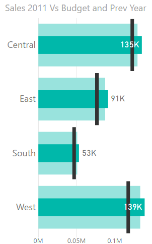
Bullet Chart
The bullet chart is a specialised bar chart typically to compare actual - reference - target
Examples
- actuals this year - actuals last year - budget this year Risk
- exposure today - risk exposure yesterday - limit
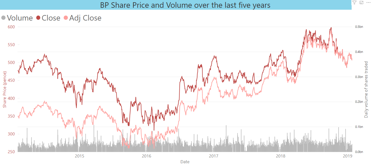
Dual axis bar and line chart
A dual axis chart compares two variables, usually over a common date/time axis. They can be useful in spotting relationships between the two variables. However, A reader must take more time and effort to understand a dual axis chart.
Ribbon chart
A ribbon chart is a variation of a stacked column chart but orders the legend items (colours) so that the biggest item in each x-axis category is at the top of the stack.
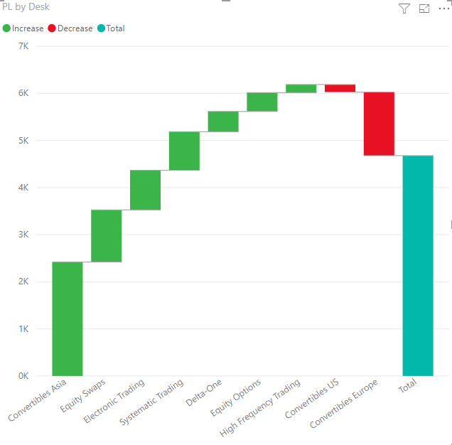
Waterfall Chart
A waterfall chart compares the contributions of several categories to a total.
Sankey Chart
A Sankey chart shows the volumme of flows from a source to a destination.
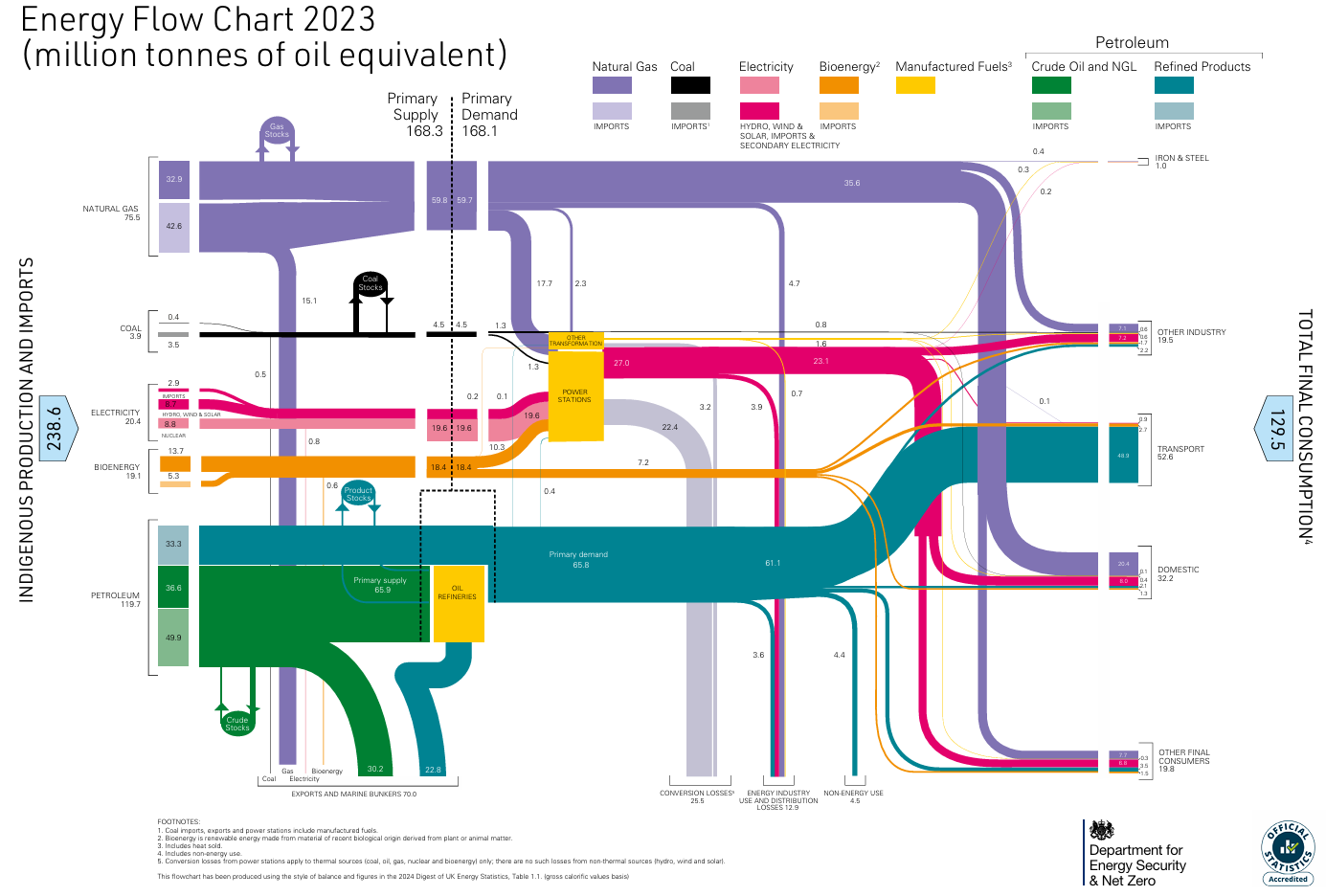
Source: Department for Energy Security & Net Zero
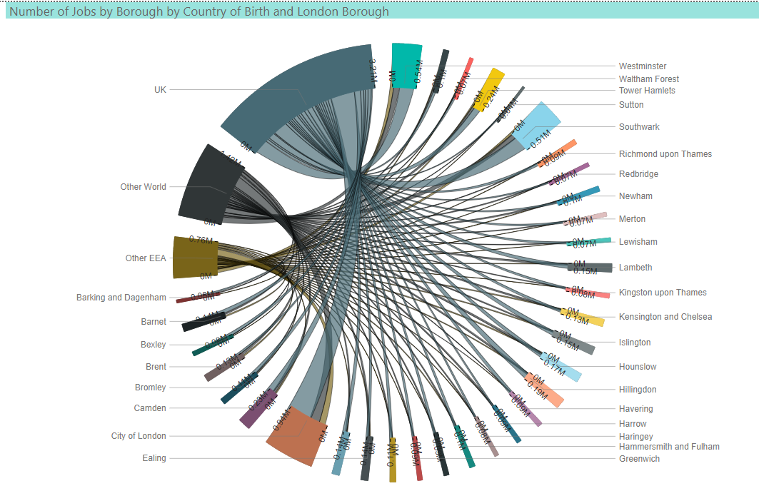
Chord Diagram
A chord diagram also shows the volumme of flows from a source to a destination. is it less effective than a Sankey for this?
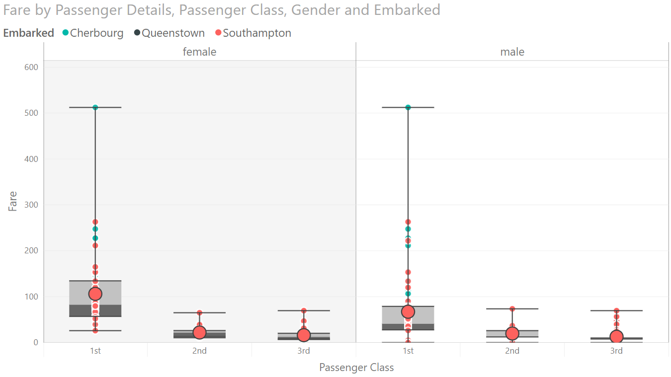
Box & Whisker
A box and whisker chart packs a lot of information and is intended only for experts in statistics.
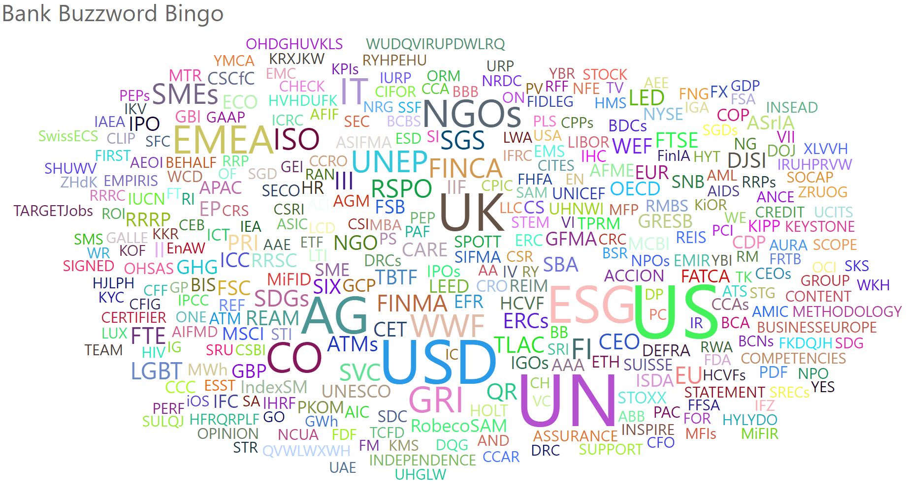
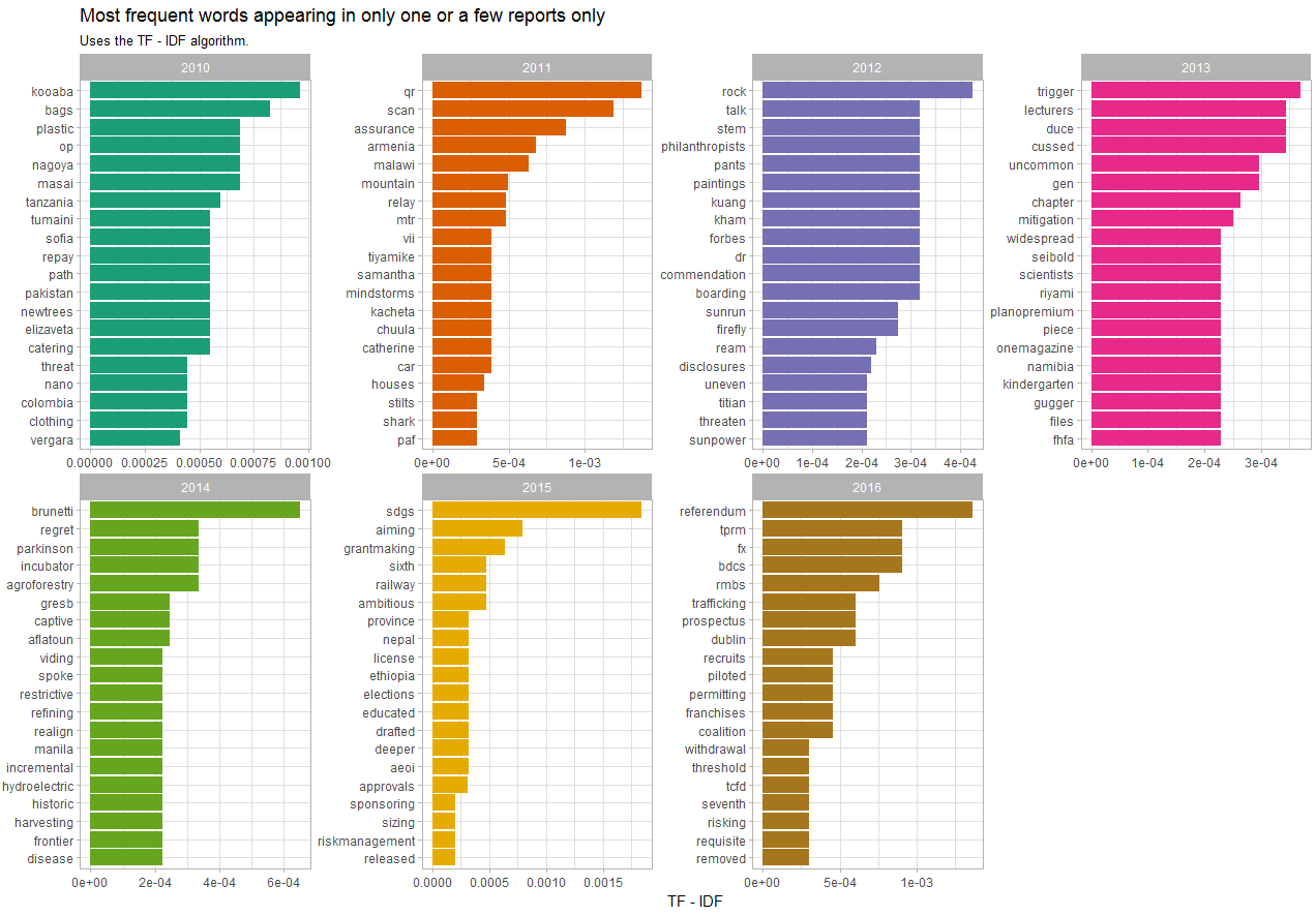
Word Cloud
A word cloud is oftena fun way to show the most important or frequent (or most favourable) words in a text.