Data and AI Training
Home | Prices | Contact Us | Courses: Power BI - Excel - Python - SQL - Generative AI - Visualising Data - Analysing Data
Discussion - Golden Rules
The trainer proposes ten golden rules for effective visualisations. We will discuss:
- Which rules resonate with you most and which do not?
- Do you disagree with any of the rules?
- Would you add any more rules (and which existing rule would you throw out if we keep to a maximum of ten rules)?
Ten Golden Rules for Visualising Data
- Be clear about the message
- Consider your audience
- Prose matters
- Pick the simplest way
- Favour common visual types
- Tell a story
- Express large numbers in life-size terms
- Use good data
- Use colour carefully and sparingly
- Do not mislead or frustrate the reader
1: Be clear about the message
Focus attention and tell a story. Use the title and subtitle to frame the readers’ line of thought. Examples of clear messages
- Inflation is rising.
- Our buildings meet high environmental standards.
- Our cost of debt has risen but is still less than our competitors.
In this chart, the message is at the top in bold and the title follows.
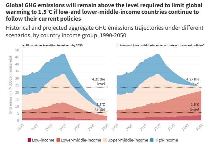
Source: World Bank Group - International Development, Poverty, & Sustainability
2: Consider your audience
Here are some questions to ask about your audience when starting to design a visual that will improve the end result.
- Who is your audience?
- What is their level of expertise, interest and engagement?
- Do readers have 5 seconds or 15 minutes to ‘get it’?
- What is the purpose? To inform, entertain, persuade, or simply to explore the data?
- Should the visualisation be impartial vs prescriptive?
- How often will the audience look at the visualisation? Once only? As part of a daily or monthly report?
- What channel is used for the visual? Laptop? Mobile? Perhaps a presentation where the author can speak and explain data and insights?
- Should it include what-if?
- Should it include personalisation?
Alberto Cairo’s definitions (journalism background)
Alberto Cairo is a Spanish information designer and a professor of Visual Journalism at the University of Miami. He has a background in data journalism. He has a useful definition of what makes a good visualisation that emphasises the reader (audience).
A visualisation is a graphical representation designed to enable exploration, analysis, communication. A good visualisation is:
- based on good data
- attracts the readers’ attention
- does not frustrate readers
- shows the right amount of data (does not oversimplify)
Alberto’s latest book is How Charts Lie.
Example
This visualisation may appeal mostly to children.
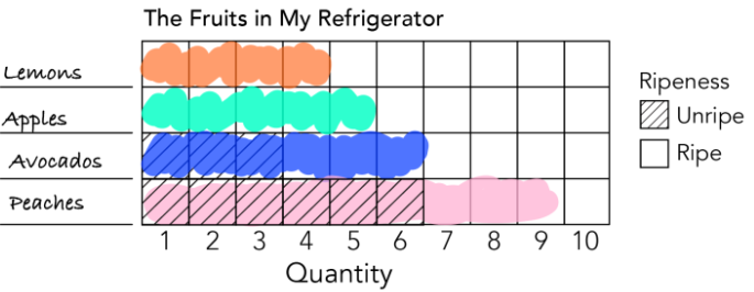
Source: THE KIDS’ TABLE: Draw Along Dataviz , Nightingale (nightingaledvs.com)
3: Prose matters
Short clear English for the written elements of a chart can really help understanding.
- Make your point, don’t state a fact.
- Choose the words carefully in the title, subtitle and footnotes of a chart.
- The title states the headline point.
- The subtitle states secondary point.
- The footnotes provide data source links.
- A commentary often follows.
- Label axes clearly. State the units of measure
- Label any legend clearly
- Use lines and annotation to highlight key points and events
Consider following a typical newspaper article organisation:
Headline > bye-line > chart > summary > detail
Always label units. For example, car fuel efficiency: miles per US gallon or kilometres per litre?
Don’t use excessive precision. 2 or 3 significant figures is normally enough. For example:
- £381K is probably better than £381,123.78 and much better than £381123.789
- 20-June-1995 is probably better than 28-June-1995 12:34.567
- 12% is probably better than 12.345%
Example
Inspect the chart below and identify all the prose elements. is prose used effectively in this chart?
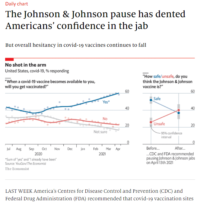
Source: The Economist
Example
This chart has a various textual adornments. How many do you see?
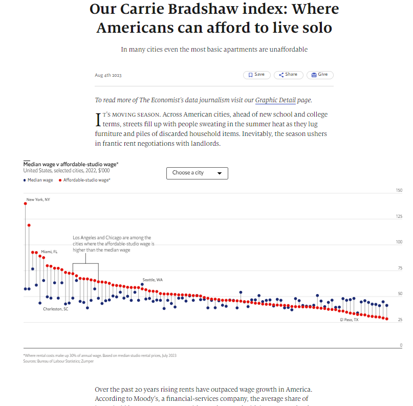
Source: Our Carrie Bradshaw index: Where Americans can afford to live solo (economist.com)
4: Pick the simplest way
Pick the simplest way but do not oversimplify.
For example, dumbbell charts show the start and finish points and the size of the change but not the details of the travel over time.
Example
This dumbbell charts shows starting point and progress.
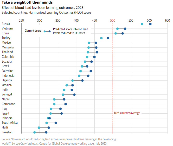
Source: To help schoolchildren in poor countries, reduce lead poisoning (economist.com)
Example
This stacked line chart has two categories only.
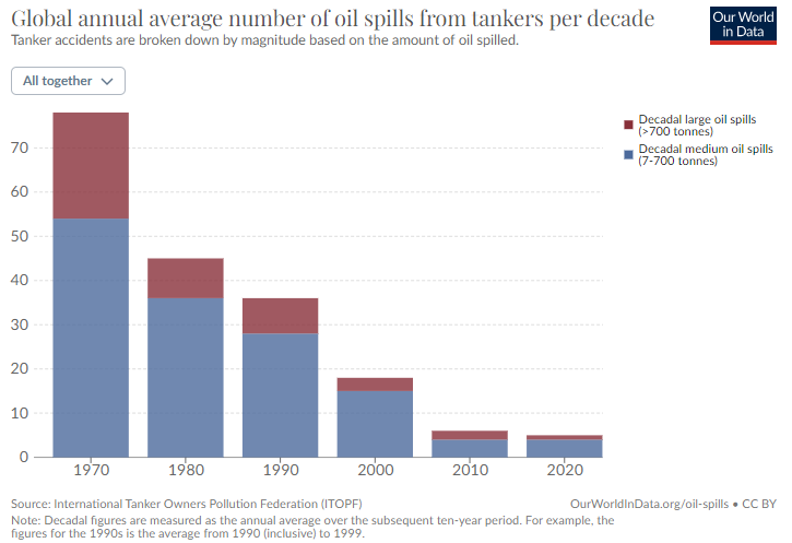
Source: Oil Spills - Our World in Data
5: Favour common visual types
Readers are familiar with common visuals; they have stood the test of time. There are only a few common visuals: bar chart, line chart, scatter plot, card, pie chart. Any other type is an obscure type.
Use variations of common types e.g., dual axis line chart, or use obscure types e.g. Mekko chart, with care.
Visual encodings map numbers into graphic properties (e.g., length, angle, colour). Academic studies suggest that people can perceive some properties much better than others. A famous study, (Cleveland, McGill, 1984) tested how accurately people could perceive values if presented with different graphic properties factors. The results were below - from more accurate to less accurate.
- Position (of a point on a scatter chart)
- Length (bar chart or a Gantt chart)
- Slope (on a slope chart)
- Angle (of a slice of a pie)
- Shape (of a marker on a map)
- Area (of a section of a tree-map)
- Colour
- Text (in a table) Source: McGill/ Cleveland
In brief this suggests people are good at “understanding” visual marks in this order:
position > length > slope > angle > area > colour > written numbers
This may suggest a rough order of preference of visual types to use when appropriate
scatter plot > bar/column chart > bump chart > pie chart > tree map > text table
Example
This scatter plot allows the reader to see when a film was released and how much it made at the box office.
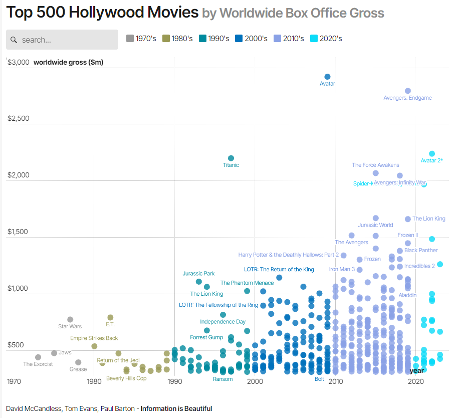
Source: What is The Most Successful Hollywood Movie of All Time? - Information is Beautiful
6: Tell a story
To build a relevent and insightful chart, imagine the reader asking these question. Does the chart provide any answers?
- So what?
- Why should I care?
- What’s the problem?
- How was it (will it be) solved?
- What must I do?
A good book on this is Storytelling with Data by Cole Nussbaumer Knaflic.
The author describes a process of five steps:
- understand the context
- choose an effective visual
- eliminate clutter
- focus attention
- tell a story
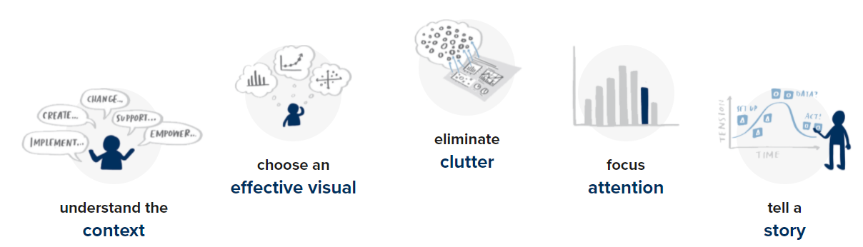
Source: Storytelling with Data
7: Express large numbers in life-size terms
People do not perceive large values well, especially thousands to millions to billions. Express units (especially large ones) in human-sized terms that people can relate to.
Example
This visual, based on Census 2021, from the ONS shows population density in a borough in terms of the number of people per football pitch

Source: Census 2021
8: Use good data
Good data is data that is collected, cleaned and tested carefully and thoroughly.
When you build a chart, it’s worth doing some quick checks that
- numbers are in the right ballpark.
- numbers are consistent. For example, do percentages in pie charts add to 100%?
(Contra) Example
This is a contra example: Which survey on best places in UK to retire?
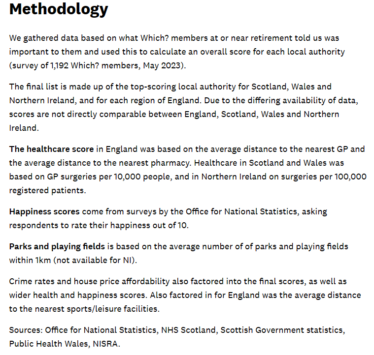
Source: Best places to retire in the UK revealed - Which? News
9: Use colour carefully and sparingly
Use colour sparingly. Take an exception reporting approach
- only show or highlight events that require attention or immediate action. e.g., an outlier
- consider the mantra “Less is more. If in doubt leave it out.”
Some colours have meaning e.g.
- red > danger,
- yellow > freshness,
- green > environmentally friendly
All colours have connotations. For example, red variously means:
- bad / danger in status reporting,
- left-wing in politics (unless you are in the US),
- the enemy in military contexts,
- a loss or price drop in financial contexts.
Hint: use ColorBrewer palettes. Their advice is specifically for maps but it works for most charts. The data can have three scales:
- Sequential: low to high e.g., population density
- Diverging: negative to positive e.g., loss - profit
- Qualitative (also known as Categorical): no order of elements e.g., product type
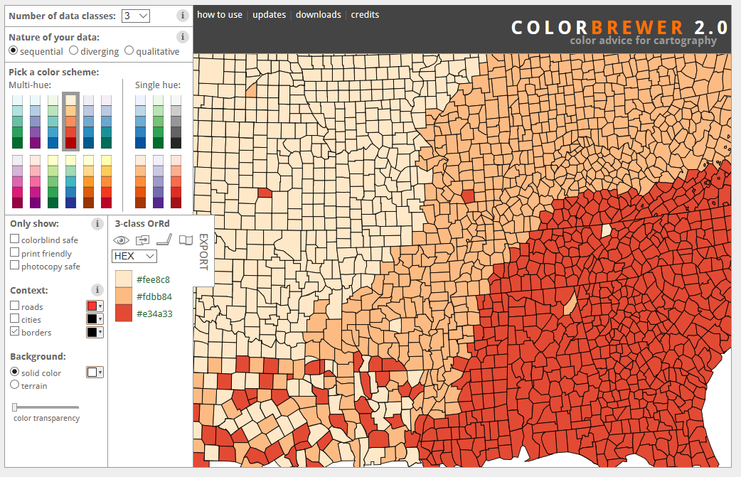
Source: ColorBrewer website
Think about accessibility: e.g., colour blind palettes.
(Contra) Example
Health Analysis in Power BI Community Gallery Source
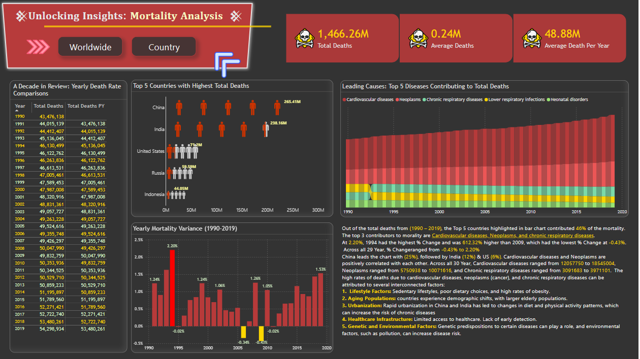
Source: Power BI Data Galleries - Mortality Analysis
10: Do not mislead or frustrate the reader
Don’t force the reader into unnecessary mental toil.
Keep the visualisation to one page or screen - avoid the need for scrolling / page turning / excessive drilldown.
Don’t mislead, either intentionally or unintentionally. For example, on column charts, start axes at zero.
Example: A chart of the 2016 US election results at county level may suggest that the Republicans (red) had a landslide victory over the Democrats (blue).