Data and AI Training
Home | Prices | Contact Us | Courses: Power BI - Excel - Python - SQL - Generative AI - Visualising Data - Analysing Data
Visual Grammar
This section describes how visual attributes relate to the characteristics of the data.
Each chart plots a set of variables
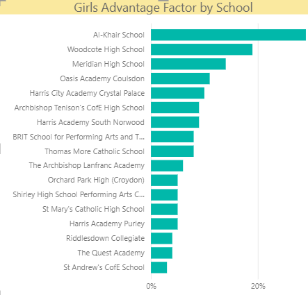
Bar chart: (1-2 categorical, 1 continuous)
- Axis: categorical
- Bar Length: continuous (optional)
- optional colour legend: categorial (fewer items)
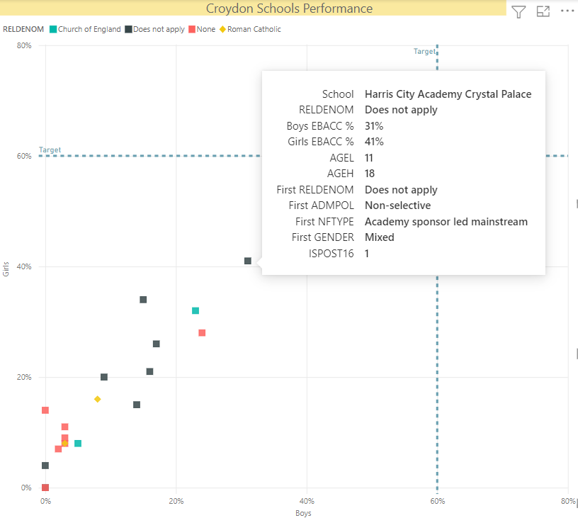
Scatter plot: (2 continuous, 1-3 categorical)
- x-axis: continuous
- y-axis: continuous
- Values: categorical marker:
Example: (stacked) bar chart
What are the categorical and continuous variables?

Example: Scatter plot
What are the categorical and continuous variables?

Reading a chart: look at the anatomy
Scaffolding provides the scope and indicates the reason, purpose.
- Chart title - purpose of the chart
- Axes - what do they measure? are these labelled clearly? Choice of start and end points?
- Sources of data: are they shown, trustworthy
Visual encoding translates quantities to marks and symbols
- position , length, slope, angle ,colour (hue and shade),area
- Less often used: shape, pattern, line thickness
Context (author,intended audience, location of report)
Grammar of Graphics
- data geometries are the basic configuration of the chart e.g. line, column
- aesthetics map visual attributes (x, y, colour, shape, fill, alpha) to dataset columns.
- scales configure the axes and set ranges, limits on visual attributes
- stats summarise the data before plotting, most obviously in box plots
- facets - small multiple charts
Source: ggplot2 (ggplot2-book.org) Hadley Wickham