Data and AI Training
Home | Prices | Contact Us | Courses: Power BI - Excel - Python - SQL - Generative AI - Visualising Data - Analysing Data
Power BI Overview
This is a whirlwind tour to introduce you to Power BI and help you decide if you want to invest time and effort in learning how to use it well.
What is Power BI?
Power BI is a (proprietary) business intelligence tool from Microsoft. It is the most popular BI software on the planet (according to Microsoft). Here is Microsoft’s Power BI marketing page.
Desktop and Service
Power BI has two parts:
- Power BI Desktop, a free application for building reports (Windows only). Used by report designers.
- Power BI Service, a cloud service for report consumers: read and interact with reports
Power BI Desktop as of March 2025
Power BI Service as of March 2025
Power BI Desktop Components
Power BI Desktop stitches together several components:
- Query Editor: import, Transform and clean dataset, so that they are in good shape to analyse and visualise
- Report View : choose, configure, layout visuals on a canvas to create the report
- Data Modelling: arrange tables and columns and relationships
- DAX: the calculation and modelling language of Power BI
- (new) TMDL: a code first way of editing a Power BI report or model
Power BI Desktop has several views and editors. You will get to know these well. These are:
- the query editor: import and shape data
- report view: a canvas to choose, configure and format visuals to build the report design
- table view: a convenient wat of see the data of all tables imported into Power BI
- model view: the structure of the semantic model: tables, columns, relationships, formats, hierarchies, measures,..
- DAX query view: a proper editor to write and test DAX: much better than the formula bar
- TMDL view: a newish view that allows a code first approach to changing every aspect of the report: useful for advanced developers
Import, shape and clean data in the Query Editor
The Query Editor is a thing of wonder! It allows us to import our data for all sorts of different sources (database, CSV, Excel, …), clean and shape our data to make it ready for visualisation and analysis. It has a user interface so we can apply the transformations that we need. Under the covers, it writes a language (called M) so these steps can be automated and data refreshed on demand or on schedule
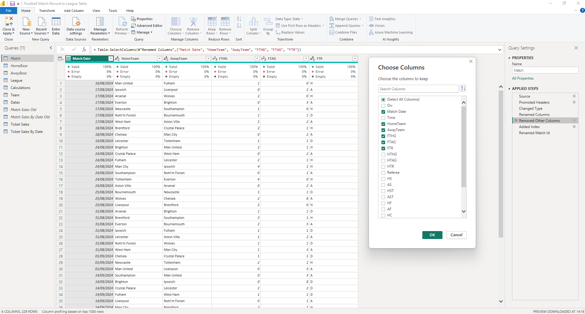
Power BI Desktop’s Query Editor.
Generative AI models, such as ChatGPT, can help a lot with Power Query and M.
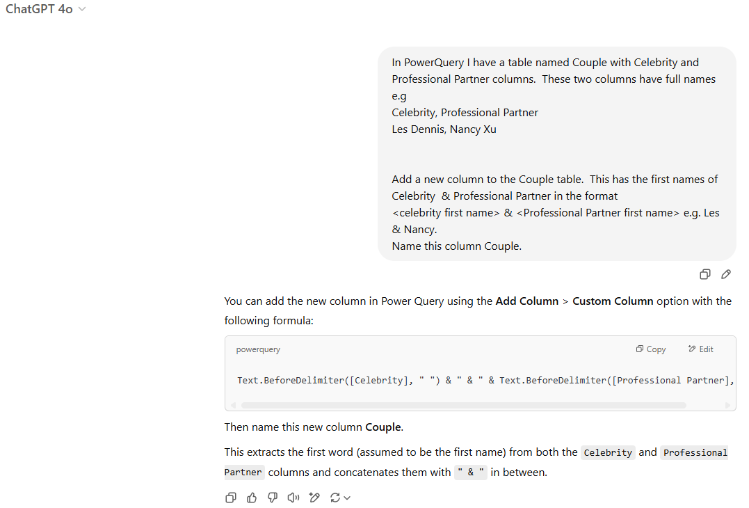
ChatGPT conversation to solve Power Query problem.
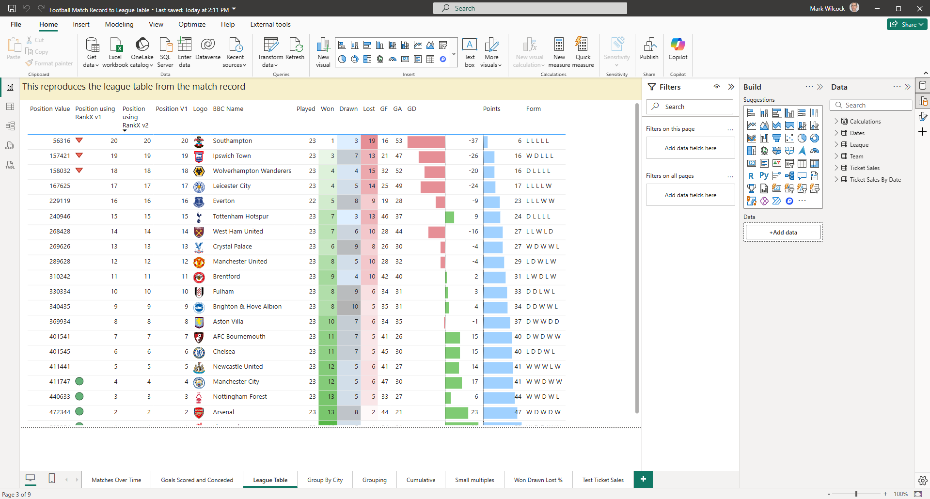
Design the visuals and report pages in the report view
A Power BI report has one or more pages. Each page contains one or more visuals. A visual is an interactive chart - the report consumer will be able to filter, drill into detail on the chart.
Charts on a page can interact with each other. For example, selecting a particular category on a bar chart can filter the data shown by other visuals on the page to that category only.
The report view has the report canvas and several panes.
Power BI Desktop’s report view canvas.
The panes are:
- the Data pane: the list of tables and columns - drag these onto a visual to configure
- the Build pane: shows the configuration of the model: maps fields (columns) to visual aspects. e.g. for a column chart, Place Region field on the x-axis
- the Format pane: the layout and aesthetics of the reports (colours, line-styles, data labels). A preview feature, on-object formatting can now do the basics of this in a more intuitive way.
- the Filters pane: provide a mechanism to add interactive filters. Three scopes: visual, page and all pages (entire report). This is an alternative to slicers.
Other panes are also available and occasionally useful.
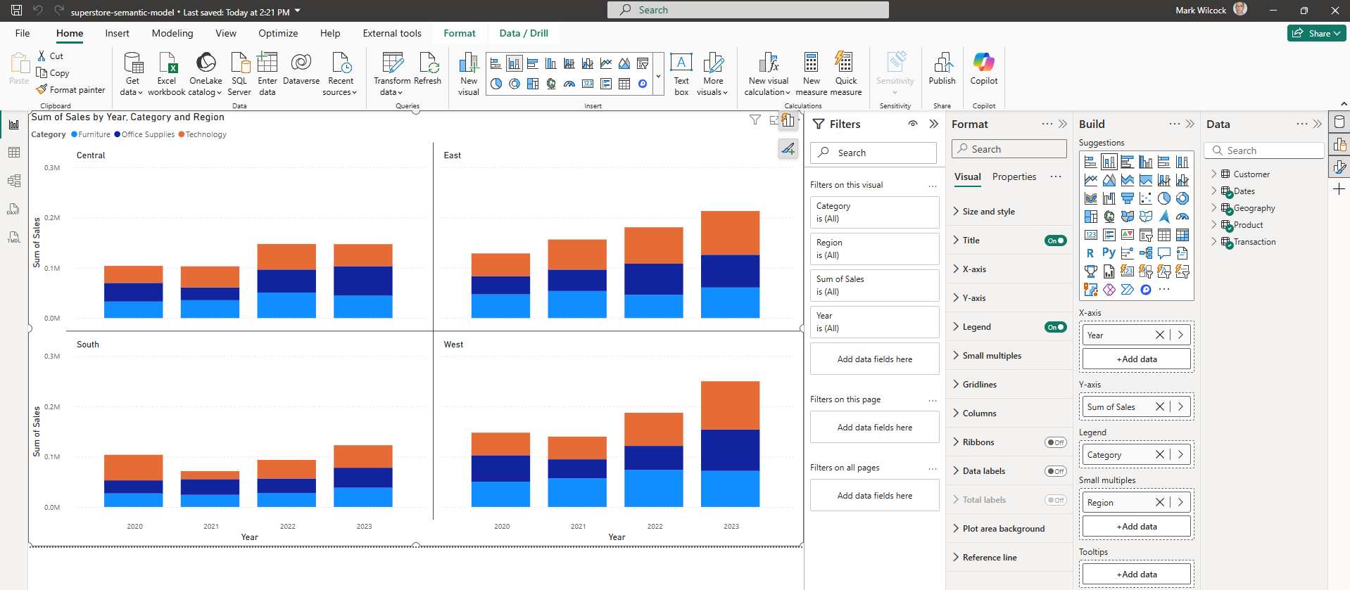
Power BI Desktop’s report view with panes on the right. From right to left these are Data, Build, Format and Filters.
The Visual Gallery
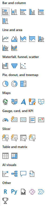
The visuals gallery contains about 30 different types of visual. We can group these into:
- bar and column charts: stacked, clustered: 100% variations
- line charts (and area charts)
- combinations of line and bar charts
- pie charts and tree maps
- cards: important single values
- slicers: allow user to filter the data
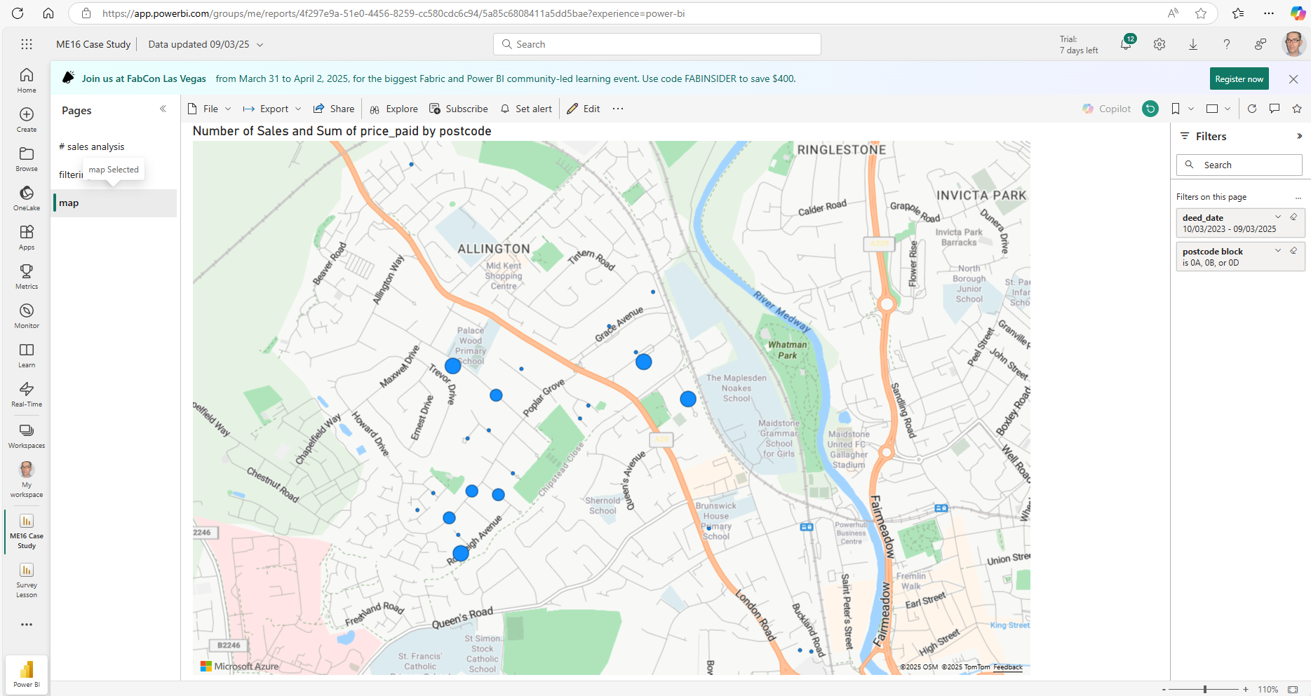
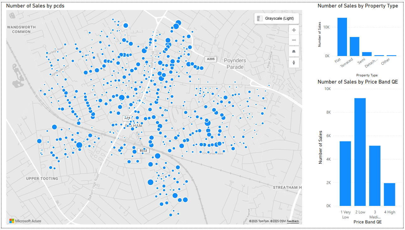
- geospatial maps, of which the Azure map visual is the first-amongst-equals
- “AI-assisted” tools such as Key Influencers
Power BI Desktop’s visual gallery
View data in the Table View
In the table view, you can see all the data in the model (and filter, sort the data).
Power BI Desktop’s Table View
Build a semantic model in the Model View
A semantic model is a copy of all the data imported by the Query Editor. It usually has several tables. But its much more tha a simple dataset - the semantic model also includes the metadata / meaning of the model added by the designer:
- the relationships between the tables,
- the calculations (implemented as DAX measures) e.g. year-to-date sales,
- hierarchies: navigation paths such as year -> quarter -> month -> date,
- the column formats,
- the definition of a calculated column,
- and possibly other information: a description of each column, synonyms for each column and table etc.
Data (semantic) modelling is the fundamental challenge! The analytical power of Power BI comes from arranging several tables with relationships. Relationships match columns into two tables that have the same domain of values. This allows report builders to choose any set of columns from any table in the data model and place on to a visual and that visual will work properly - no need for any Excel XLOOKUP or SQL JOIN statements.
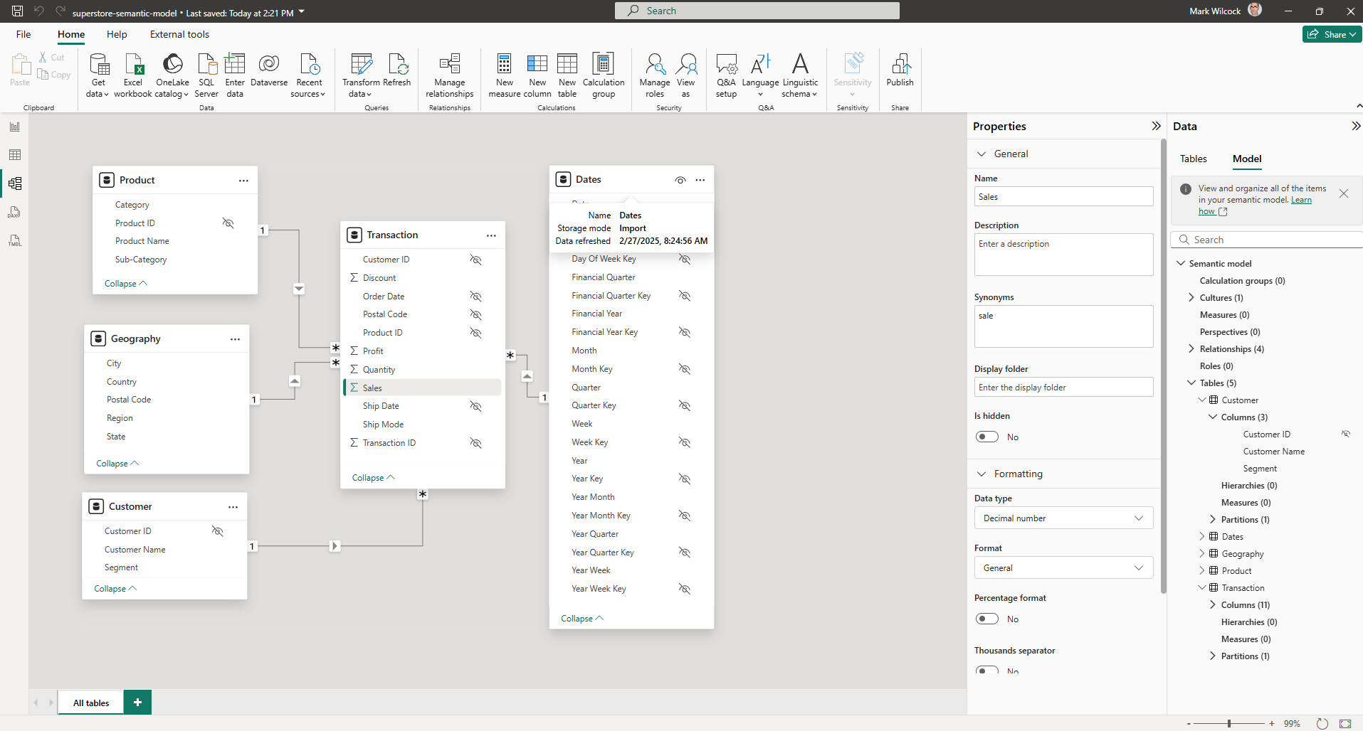
Power BI Desktop’s Model View.
Write and test measures in the DAX Query View
The DAX query view is a game changer for learning, understanding, writing and testing DAX. It is an alternative to writing DAX in the formula bar. It is a proper editor (using the codebase of the very popular VSCode). It encourages structured thinking about DAX problems rather than hack-it-and-hope approach.
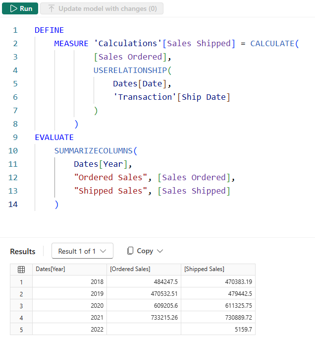
The DAX query view helps us write, test and understand DAX.
The “Quick queries” functionality writes some starter example DAX.
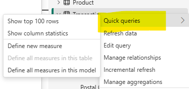
The “Quick Queries” context menu in Power BI Desktop’s DAX Query View.
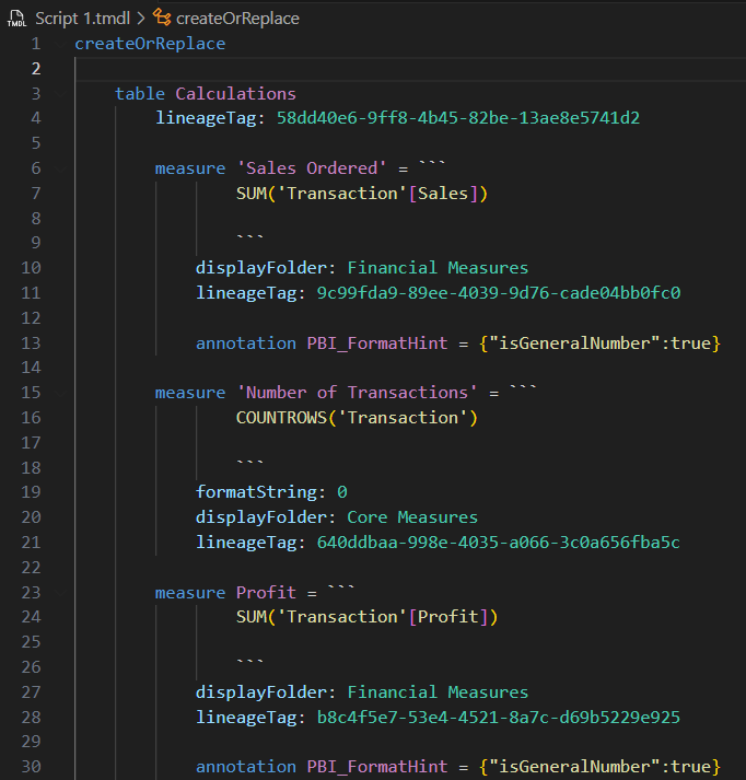
Edit the report and model TMDL and the TMDL view
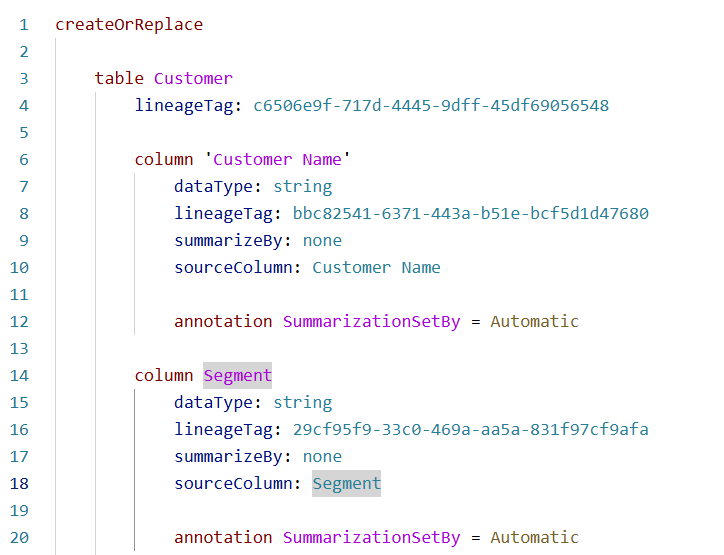
TMDL stands for Tabular Model Definition Language. It is a domain-specific language to define and manage Power BI models in Power BI. It is text-based and human readable (in YAML syntax) so can be edited and version-controlled.
You can edit the TMDL either in
- Power BI Desktop’s TMDL View
- or save as a PBIP file (see below) and use an external editor e.g. VSCode with a TMDL extension
If you save a Power BI file as Project (PBIP) format, this creates also two subfolders:
- reports
- models that contain various TMDL files.
Power BI Desktop’s TMDL View.
Edit TMDL in VSCode.
DAX is the calculation and modelling language
The two things that you need to know about DAX before you start your journey.
- DAX is very powerful. You need DAX to create many useful calculations such as ratio of time intelligence e.g. year-to-date.
- DAX is hard. It does require time and effort to master.
Visual Calculations and Generative AI assistants, both discussed later, can make DAX less difficult.
Visual Calculations
Visual Calculations are promoted as “DAX made easy”. They provide a point and click method of writing many typical calculations in DAX that would be more difficult to write as a measure on a visual. There are some pros and cons compared to measures.
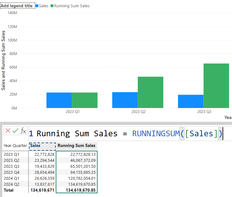
Visual Calculations Example.
Power BI Enterprise Features
Enterprise features are more important to large development teams building complex sematic models. Microsoft have been retrofitting enterprise features into Power BI Desktop and Service over the last few years. These include:
- application lifecycle management: separate dev, test ad production environment and deployment pipelines: a structured method of promoting and releasing code to these environments
- version control e.g. Git, GitHub and Azure Repos
- “code first” features: the DAX Query View, and TMDL view (described later)
- and of course, Microsoft Fabric (discussed later)
Use AI models to help with Power BI challenges
In order of importance, AI Models can help with:
- DAX
- M (the language of PowerQuery)
- data modelling advice (import an image of the semantic model into the AI model)
- TMDL (but we are all learning how to use this best)
- report layout and design (Copilot only)
Two options
- internal to Power BI: Copilot, if you have the license.
- external to Power BI: ChatGPT, Claude, or your preferred tool
External AI assistants work well once we provide some context about the model to the AI assistant. This could be an image of the model view or an equivalent written description of the model (in terms table and column names, star schema arrangement, facts and dimension tables etc).
Here is an example exercise and a shared ChatGPT conversation.
Skills needed for mastery of Power BI
Several skills are needed to master all of Power BI.
- shape in the query editor: improve data quality, reshape data: use operations such as merge tables, add columns, unpivot a table.
- build meaningful, useful, actionable reports: skills include business analysis, design effective visualisations, user interface and graphic design
- create a semantic model: knowledge of dimensional modelling, star schema pattern , fact and dimension tables
- code in DAX (which requires understanding of how Power BI works under the covers at a deep level)
Typically, one person does not have all of these skills. A team is often split into sub-teams:
- the model builders specialise in data shaping, data modelling and DAX publish a semantic data model to the service
- the report builders specialise in business analysis and graphic design and build the reports
Other tools are available as well as Power BI Desktop
There are other tools as well as Power BI Desktop that allow report builders to see further under the covers. These are usual free or freemium licenses. They include:
- Bravo: shows size of columns in memory (smaller is better for performance). It also highlights fields in the data that are not used in the report
- DAX Studio: largely replaced by the introduction of the DAX query view but has the capability to look at the size of the model ina more detailed way than Bravo
- Tabular Editor: a code-first way of editing a Power BI file. Useful for advanced developers and complex models
There are available as standalone and also available as extensions to Power BI Desktop.
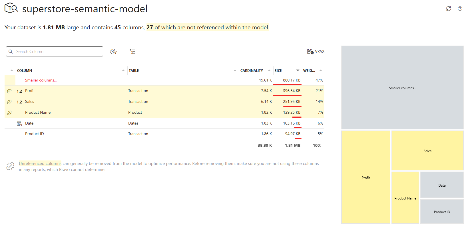
This Bravo model analysis shows column sizes and highlights columns that are not used on any visual on any report so could possibly be removed
The shortest history of the evolution of Power BI
Here is the shortest form of the long history of Power BI. It start with the heritage that goes back further than you may expect.
- 1950s: the Simulmatics Corporation: using data in 1960 US presidential elections. The story is told in the book If Then.
- 1960s: expensive executive decision support systems such as Comshare
- 1970: the birth of SQL
The Power BI story proper starts more the a quarter century ago.
- 2000s: Microsoft “Cubes” (Analysis Services and the MDX language)
- 2009: Microsoft announced some new technologies: “tabular”, DAX (marketed initially as a simpler form of MDX) and Power Query: all squeezed into Excel add-ins (PowerPivot, PowerQuery, PowerView)
- 2015: Power BI announced. PowerPivot, PowerQuery, PowerView combined into single standalone application: Power BI Desktop. Tagline “5 minutes to wow”. Here is the official announcement.
- 2016 onwards to today: continuous improvements and extensions with monthly releases
- 2023: Microsoft Fabric announced; all things data engineering, data science, data analysis in one SaaS platforms: Power BI becomes part of Fabric
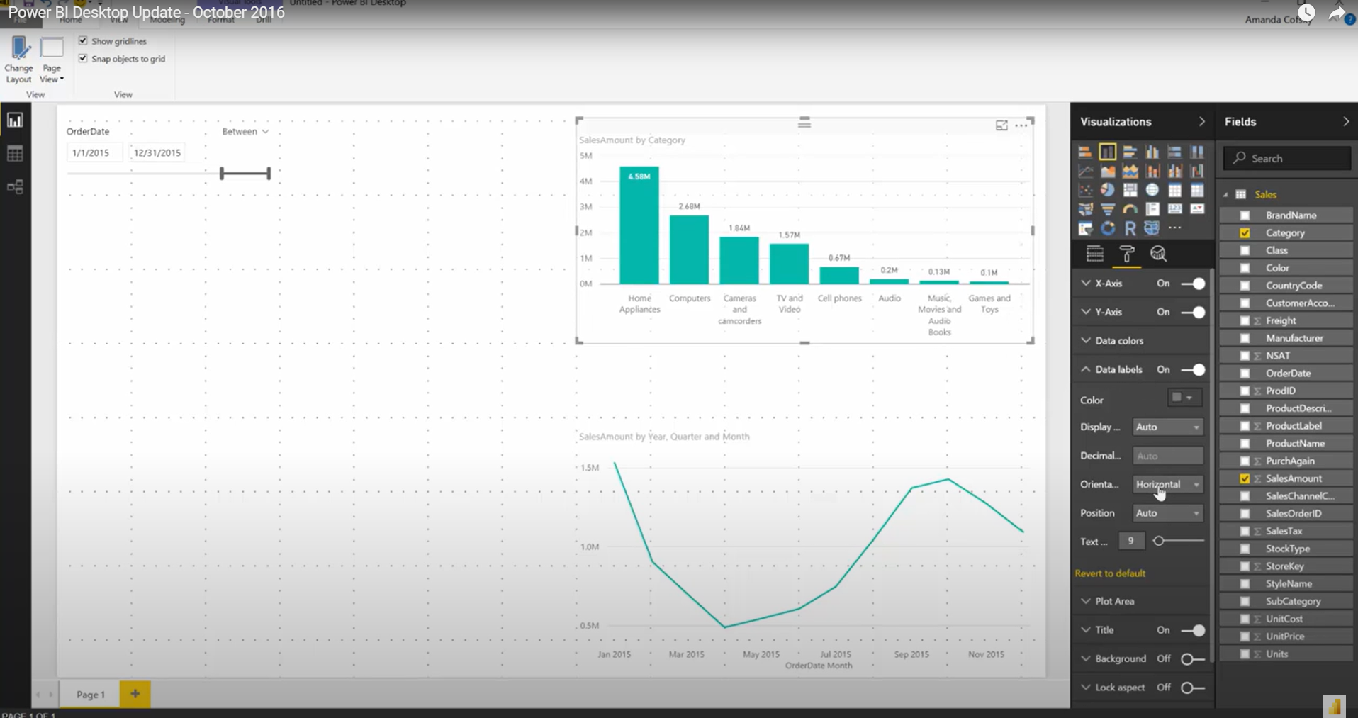
Power BI Desktop from the October 2016 blog post.
Why learn Power BI?
- Perhaps, because your organisation requires it.
- It is a marketable skill.
- You also learn about data & analytics in general.
Recommendation: Use Power BI as part of your data analyst’s armoury
My recommendation - use Power BI as one tool of many to help solve data challenges. Other tools may include:
- Python: the defacto open-source language of data analysis, data science and AI
- SQL: at least how to retrieve data with the SELECT statement
- Excel: has become more capable with data challenges in recent years: Python in Excel, Power Query (as with Power BI), and a beefed-up formula language that can operate of datasets and arrays
Resources to help learn Power BI
There are a lot of great resources available, for example:
- YouTube tutorials, some of very high quality
- in-person and virtual meetups.
- conferences such as sqlbits.
A short list of learning resources here.
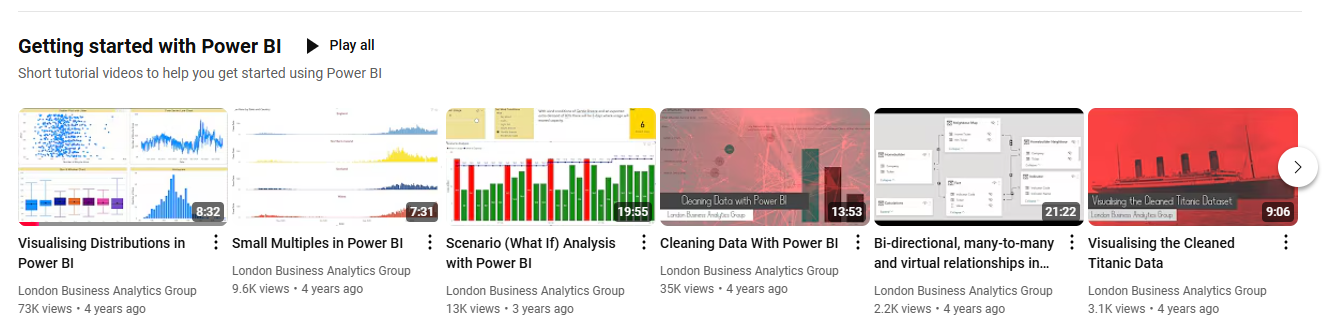
A Getting Started in Power BI playlist on YouTube. Direct Link here.
How to get started
- Go to a Power BI meetup, either in-person or virtual.
- Grab some interesting data, either from work or public data.
- Sell your Mac, buy a PC, then download Power BI Desktop (it’s free).
- Have a go. Us the learning resources above. And remember “5 minutes to wow”.
Power BI is part of Microsoft Fabric
Power BI is now one component Of Microsoft Fabric. This is Microsoft’s end-to-end data everything (BI , data science, data engineering) offering
Fabric is purely Software as a Service (SaaS). Access through a web browser
The heart is a data lake named OneLake. Think of this as a collection of large files. (Data is in Delta-Parquet format). Many tools can read / write from the OneLake
- Power BI Data models can be built on top of the data lake (and it’s very efficient)
- The data lake has a “SQL endpoint”. We can explore and analyse with SQL SELECT.
- Dataflows (PowerQuery in the cloud) to shape and transform data
- Python notebooks do data science or data engineering (with Spark)
- other data tools: Azure Data Factory
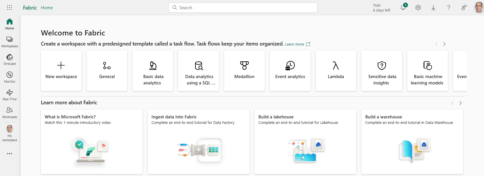
Microsoft Fabric landing Page.
Here is Microsoft’s elevator paragraph. Microsoft Fabric is an enterprise-ready, end-to-end analytics platform. It unifies data movement, data processing, ingestion, transformation, real-time event routing, and report building. It supports these capabilities with integrated services like Data Engineering, Data Factory, Data Science, Real-Time Intelligence, Data Warehouse, and Databases.
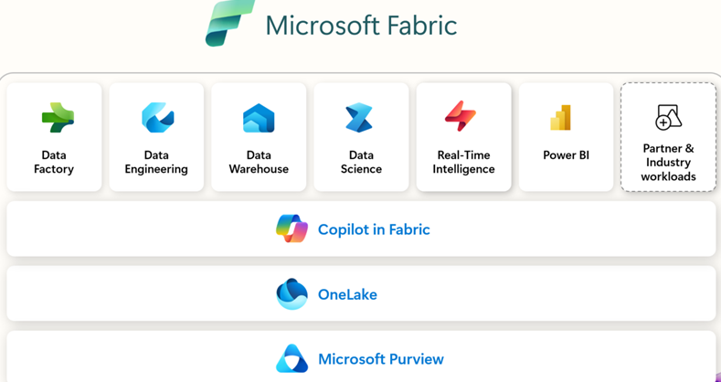
Microsoft Fabric Architecture Stack.
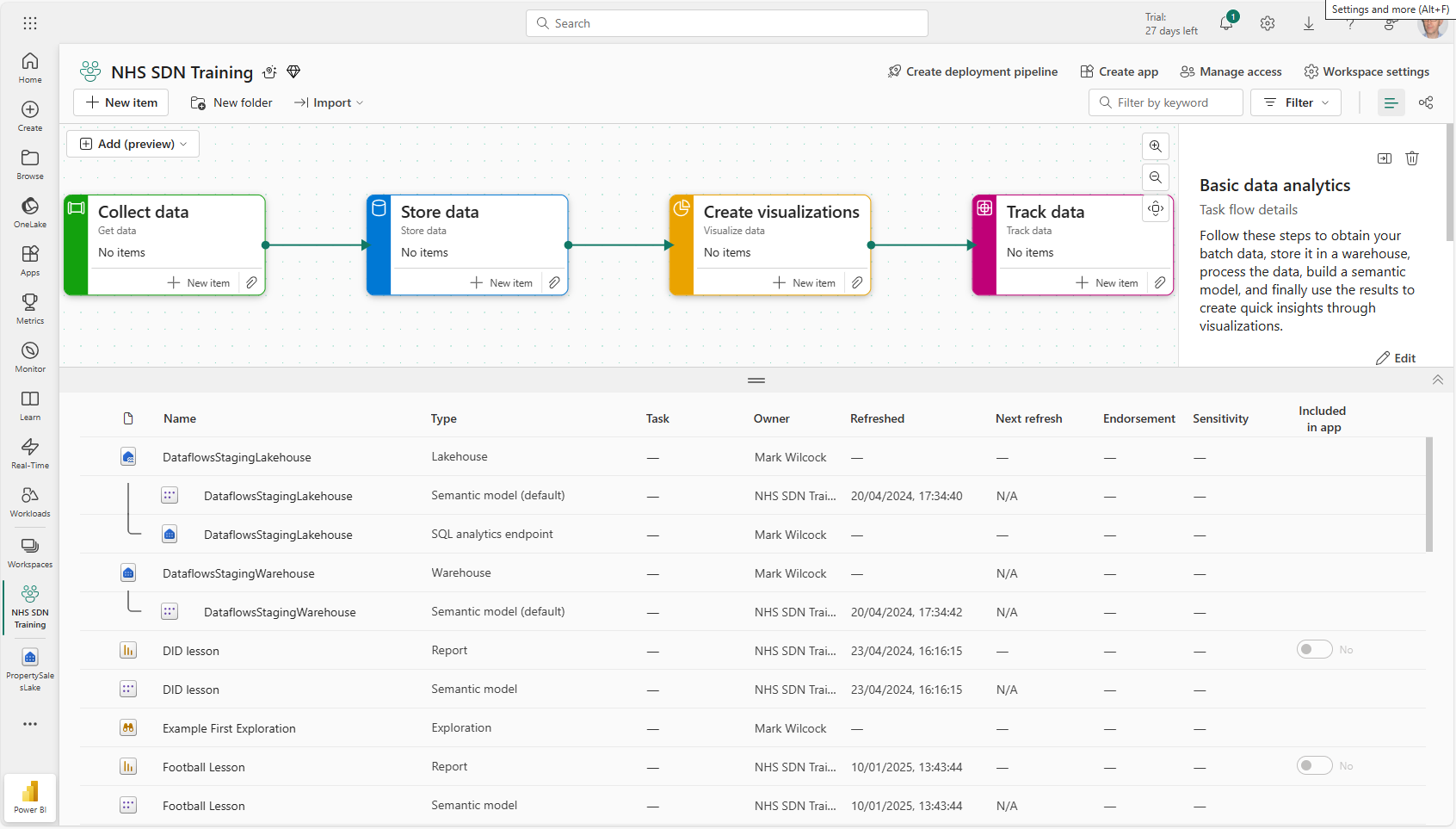
Fabric Workspace Example.
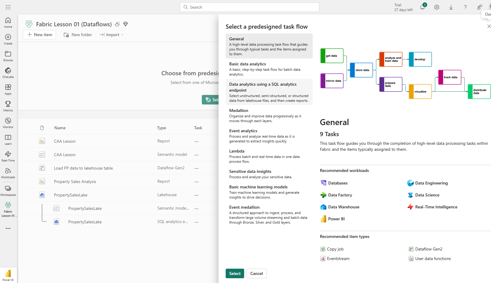
Fabric Task Flows.
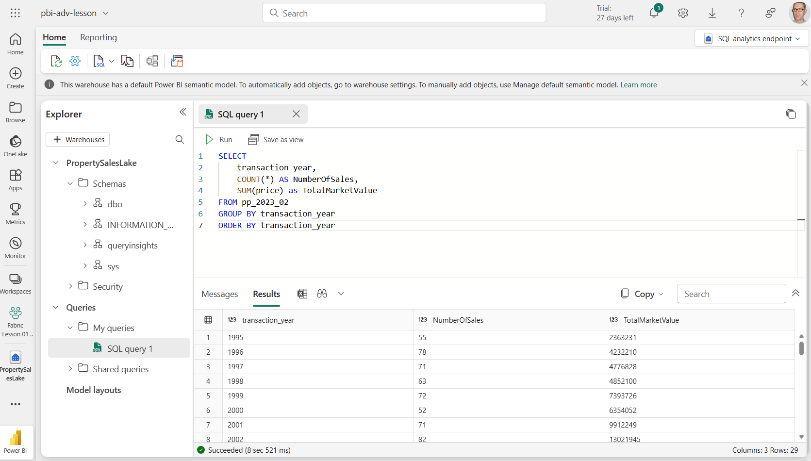
Fabric SQL Endpoint.
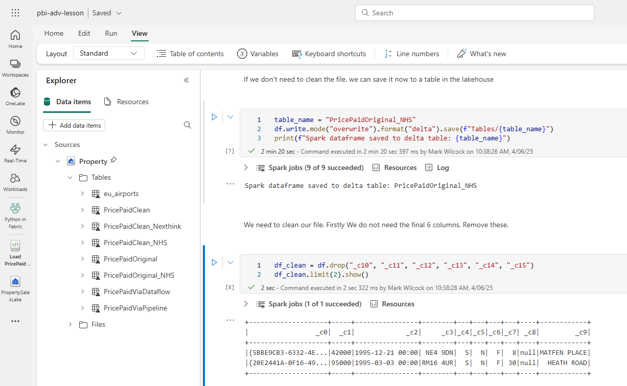
Fabric Python Notebook.